Our Brand Guidelines
Welome to our brand guidelines portal. This page outlines all the design details that will keep our brand consistent and coherent across all channels.
Scroll downOur Story
Using simulation, and through the augmentation of human intelligence, we’re going to reframe how we all see the world.
Through sharper foresight, we will bring tomorrow closer to today, enabling better decision making and generating greater wisdom.
Our products and services allow people to ask the big questions, make a decision, understand its consequences and re-engineer it with zero risk.
Our Brand DNA
Our brand DNA encapsulates our ambition as a business. It acts as a north star which gives overarching creative direction and ultimately informs each and every touch point of the brand. It defines what it means to be part of Simudyne’s greater proposition.
It provides a clear direction and brand spirit which can be interpreted by stakeholders and staff to develop a common sense of purpose and visual language. This DNA definition is intended to make everyone within Simudyne a brand ambassador, or marketeer, with a common message, approach and outlook.
Our Purpose
To help bring enlightenment.
Our Principles
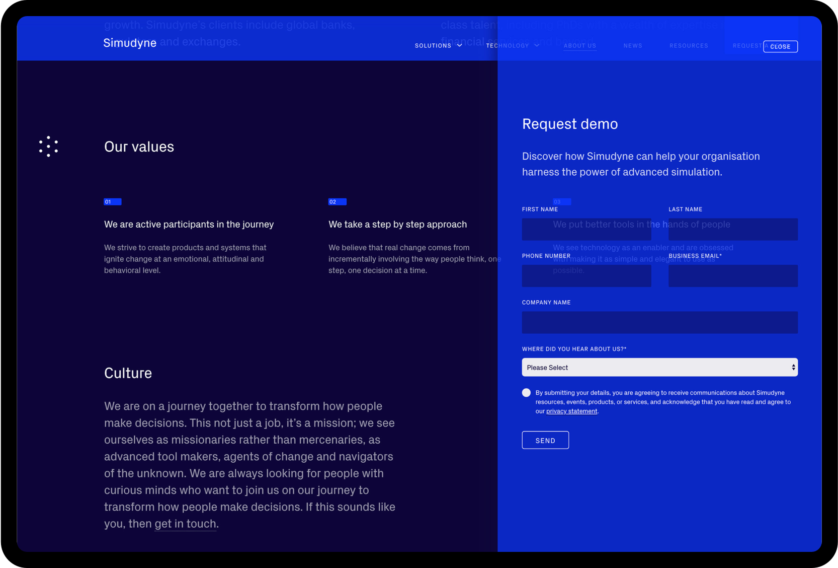
We are active participants in the journey. We strive to create products and systems that ignite change at an emotional, attitudinal and behavioral level.
We are: Involved, Listeners, Trusted
We take a step-by-step approach. We believe that real change comes from incrementally evolving the way people think, one step, one decision at a time.
We: Iterate, Evolve, Improve.
We put better tools in the hands of people. We see technology as an enabler and are obsessed with making it as simple and elegant to use as possible.
We are: Transparent, Observant, Attentive.
Logo
Our logo symbolizes our business and consists of the Dynamic Hexagon and Simudyne Logotype. They have been designed to be used together or separately depending on the communication. Both are unique markers and encapsulate how we think and what we do.
Combination Logo
This version of the logo should be used when you have little space to position them as separate elements and you want to make a greater connection between the name of the business and the symbol.
Dynamic Hexagon Symbol
This symbol has been created to demonstrate the dynamic, behavioral and organic nature of the simulation. It has natural geometry. It is simple and elegant. It is a powerful emblem for a future-facing tech company and should be used with pride. The logo has also been specifically designed to animate, so it has behavior and life of its own. This fluidity and playfulness should be used wherever possible.

Logotype with Strapline
The strapline simply communicates the vision of the business. It has a unique relationship with the logotype and this should be adhered to whenever it is used. A separate artwork has been created for this purpose. This version of the logo should only be used as a sign-off on any marketing or brand collateral.

Logo Relationship and Clearance Area
The relationship between the Dynamic Hexagon and Logotype is very specific and should be adhered to at all times. There is also a defined clearance area where no other graphic elements should be placed.
Logo Color Usage
The logo should only ever appear in the primary colors of the identity (see color section).

01. White / Vivid Blue

02. Vivid Blue / White

03. Vivid Blue / Light Grey

04. White / Dark Purple
Animated Logo
The Dynamic Hexagon has been specifically designed to animate. The initial set of logo animations are narrative, each demonstrating a facet of simulation. Logo animations can be used as single stand-alone loops or transitions from other animated content.
Restrictions
The logo has been designed to be flexible in terms of using the elements separately, but there are some things you shouldn’t do with the new logo.
![]() Never rotate the symbol
Never rotate the symbol
![]() Never stack the logo
Never stack the logo
![]() Never swap the order of the symbol
Never swap the order of the symbol
![]() Never space apart
Never space apart
![]() Never use multiple colors
Never use multiple colors
![]() Never tilt the logo
Never tilt the logo
![]() Never use on imagery with low contrast
Never use on imagery with low contrast
![]() Never adjust the ratios
Never adjust the ratios
![]() Never use on colors with low contrast
Never use on colors with low contrast
Color
Color plays a key role in the new visual identity. It is one of the most important parts of the brand and its usage should be carefully considered. Color is a powerful tool used to convey hierarchy, sophistication and interactivity and is often the most immediate asset for brand recognition.
Brand Colors
The vivid blue plays a key role in the brand. It is used to create future-tech aesthetic whilst maintaining a legibility and confidence required for corporate clients. There is also a multitude of other assets that require a broader color palette that we have described below.
Primary Colors
These are the primary colors for Simudyne.

15–03–60
100–98–40–60

00–45–255
92–72–04–00
Secondary Colors
The secondary colors can be used to add clarity and contrast to editorial work and used for additional diagram colors where necessary.

00–81–255
68–14–00–00

238–232–232
12–06–09–00
Diagram Colors
Additional colors have been defined for diagrams that require more subtle differences in the blue/purple color space.

09–20–138
100–91–22–06

61–00–52
95–98–00–00

230–27–114
0–96–19–0
Tonal Colors
Black should only be used in rare occasions. White is often used for backgrounds or text to give the greatest contrast.

00–81–255
68–14–00–00

238–232–232
12–06–09–00
Special Colors (Print Only)
To achieve the vivid blue through a digital print process is unachievable. To receive a close color match and a more vivid result use PANTONE 072 where ever possible.

Color Usage
As a general guide to color application on any given piece of brand collateral, here is an approximation of the quantities of color to use.
Dark Backgrounds
Digital campaigns, banners, brochure covers etc.

Light Backgrounds
Editorial, long-form content pieces

Typography
Typeface selection is one of the key components of a company’s visual identity and brand recognition. It is important to choose a typeface that embodies the values and attitude of your business. The typeface for Simudyne is PX Grotesque.
Typefaces
PX Grotesque is the primary corporate typeface. It is a modern sans serif with some distinctive angular characteristics. It is highly legible and works at large and small scales. The squared features of some of the glyphs convey the data side of the business. The Simudyne console uses both PX Grotesque and IBM Plex to display relevant data. IBM Plex has been selected due to its high legibility on screen at small sizes.
PX Grotesk
The regular weight should be used in the majority of applications including headlines and body copy

PX Grotesk Bold & Light
Light & bold should be used sparingly


IBM Plex Sans – Console Use Only
IBM Plex is used exclusively for the Simudyne console and has been selected due to its legibility on screen at small sizes, making it ideal for digital products.

Type Styling
It is important to follow some simple typographic rules to increase clarity, legibility and pace to all communications. Typography should be allowed to breathe so allow room around it when ever possible.
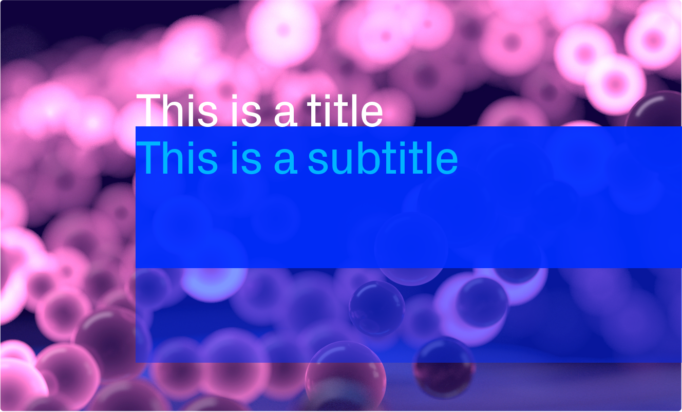
Titles
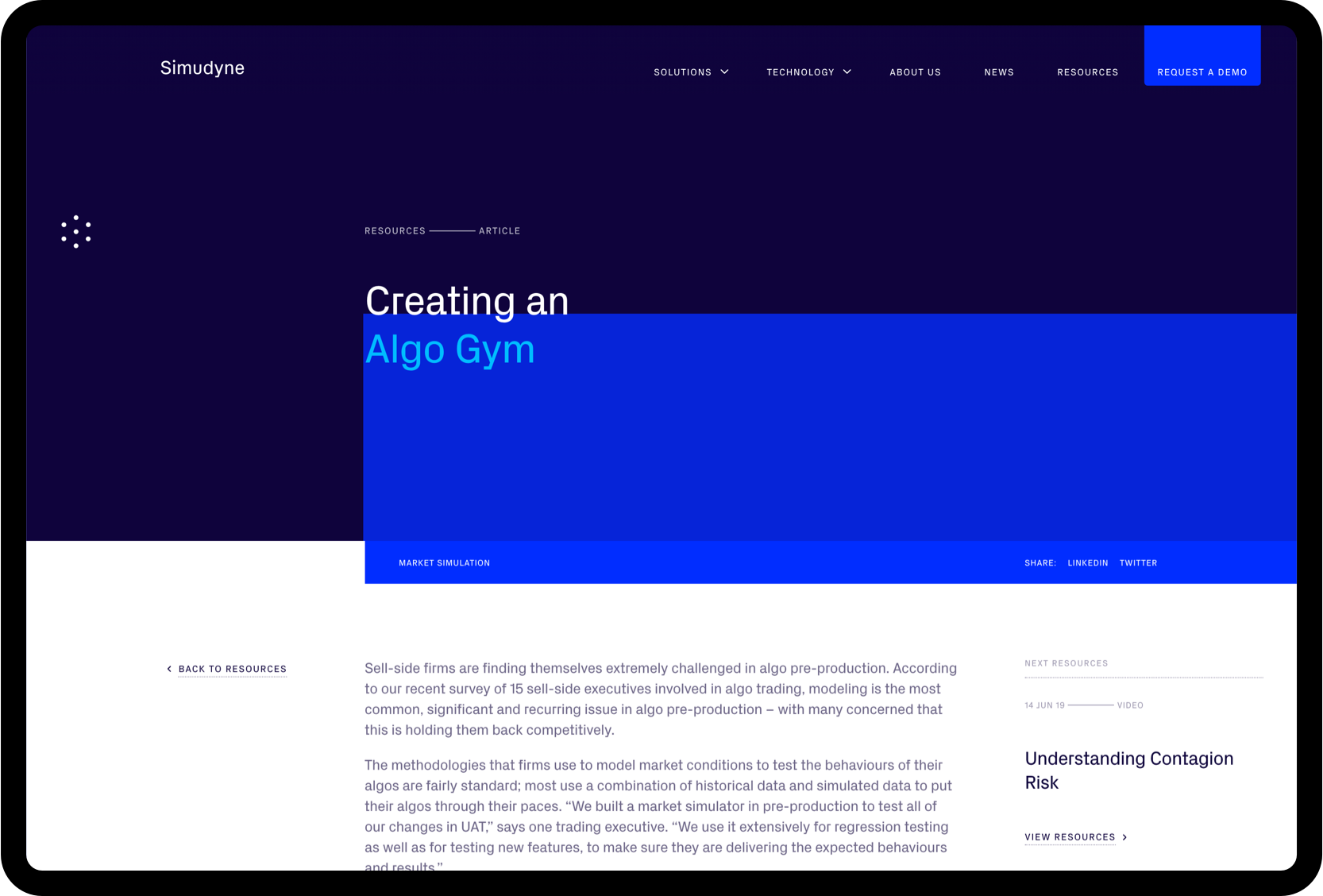
Titles have a specific typographic treatment the uses the colored blue boxes, usually set over the Simudyne brand imagery. The size of both blue boxes is defined by the line height (leading) of the title.

Title treatment example above: 46pt/46pt. Tracking @-1.5
Headings
When using the typeface at larger sizes you should reduce the spacing between letters (tracking)

Example Above: 46pt/56pts. Tracking @-1.5
Body Copy
Body copy in both digital and print executions should be clear and easy to read. Increase the ratios of type size and line height (leading)

Example Above: 15pt/24pts. Tracking @ 0
Small Type
Small type can be used to add subtle detail to the design. All type at this level should be contextual to the piece of communication and increased tracking to be used to help legibility

Example Above: 13pt/18pts. Tracking @ +1.4
Quotes
Quotes use a think graphic line at the beginning of the text to help distinguish this specific type of content. The person quoted should always be capitalized

Brand Assets
Simudyne is re-engineering the future through data and simulation. To convey this future-defining aesthetic, the visual identity was influenced by the world of science fiction. This has created a series of stylized graphics and imagery that capture this spirit and holistically communicate the sophistication of Simudyne.
Brand Imagery
We have a series of images to give Simudyne’s visual brand greater depth. All representation of data throughout the brand are based on real data creating a seam of authenticity that permeates all aspects of the business. This imagery is based on order flow data on the NASDAQ stock exchange.


Background Animations
To create a modern, sophisticated environment, we created a series of background animations to use in various channels, including the website. These should be used whenever possible to create a greater sense of depth and intrigue.
Background Patterns
Isometric dot patterns have been developed from the logo structure to help create levels of texture in printed and digital applications. These are the agreed color variants.


Graphic Elements
Additional graphic details have been influenced from the sci-fi world and are used in specific ways to create the desired aesthetic.
Line Devices
The line device is used to connect typographic elements driven by the context of the artwork.
Dotted underlines are used for links.

![]()
Tags
These boxes are used to label document types or introduce small typographic details. All these details must be relevant to the artwork.
Box Overlays
The blue box overlay create a distinct brand look and feel and should be used to hold all titles and subtitles.
See examples for application reference
Iconography
A set of icons have been created to help communicate the features and benefits of the product. Due to the often complex nature of the subject, these should be used in conjunction with text.
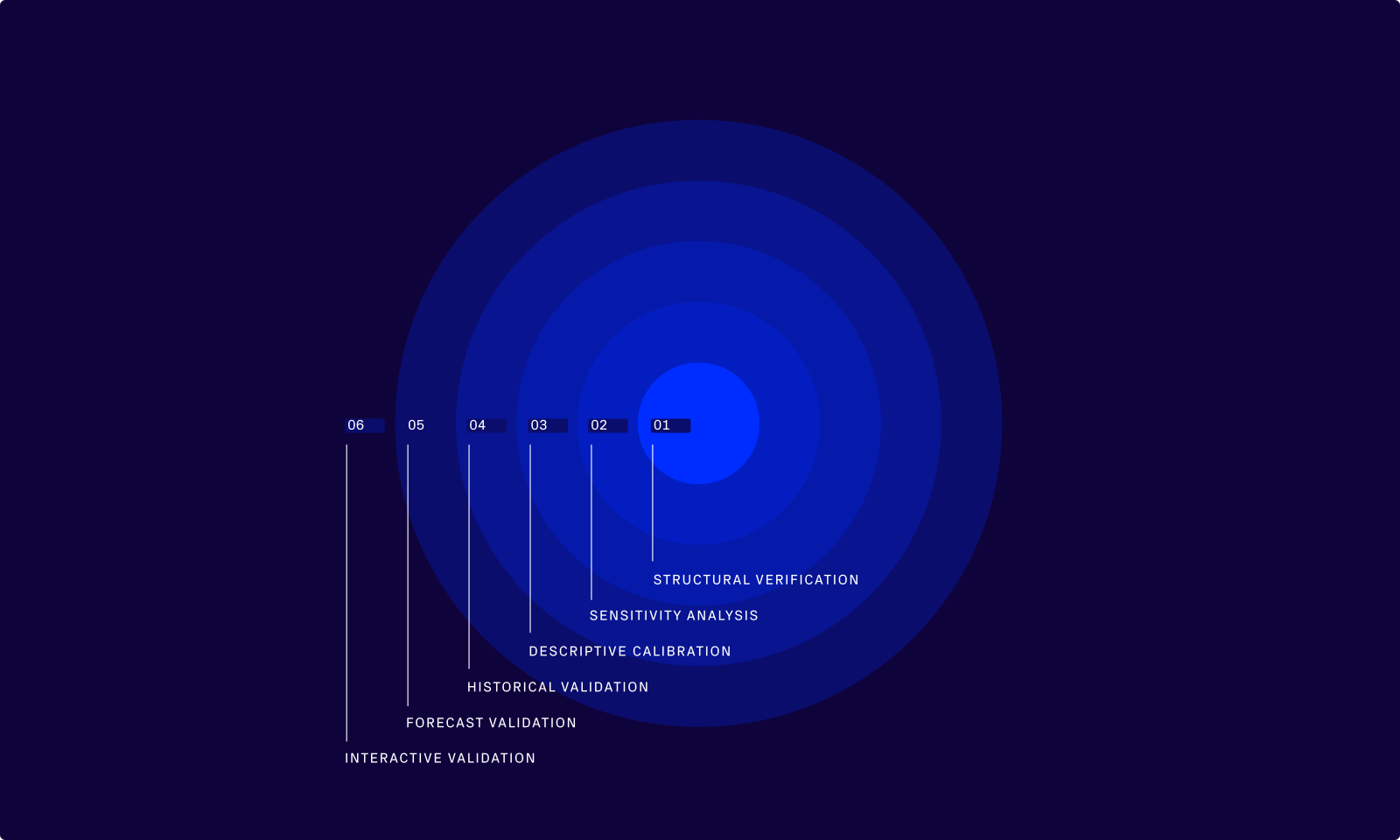
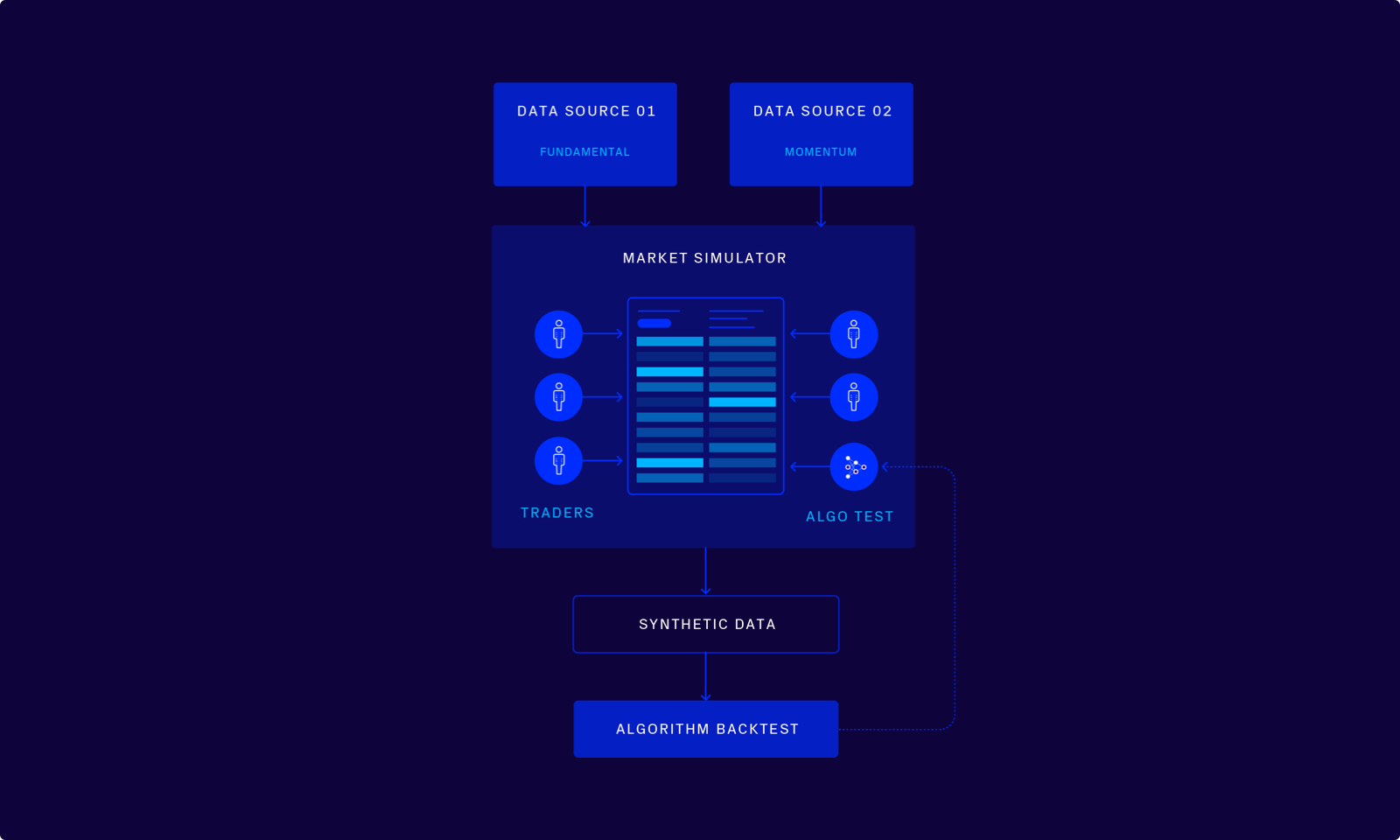
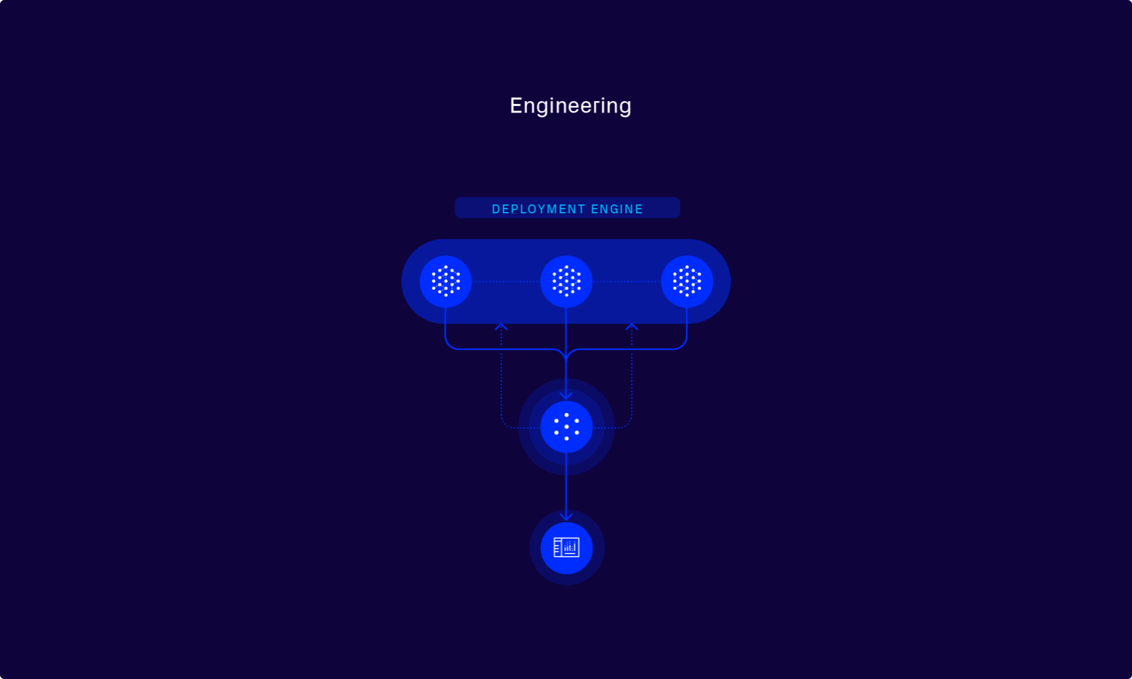
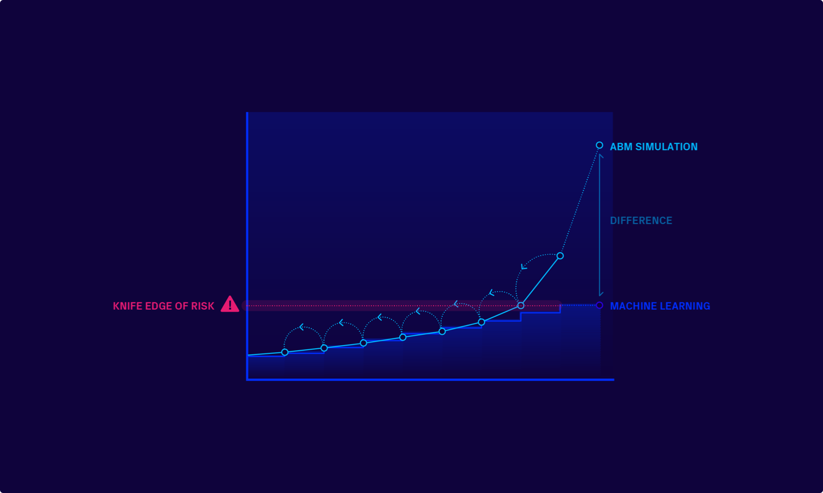
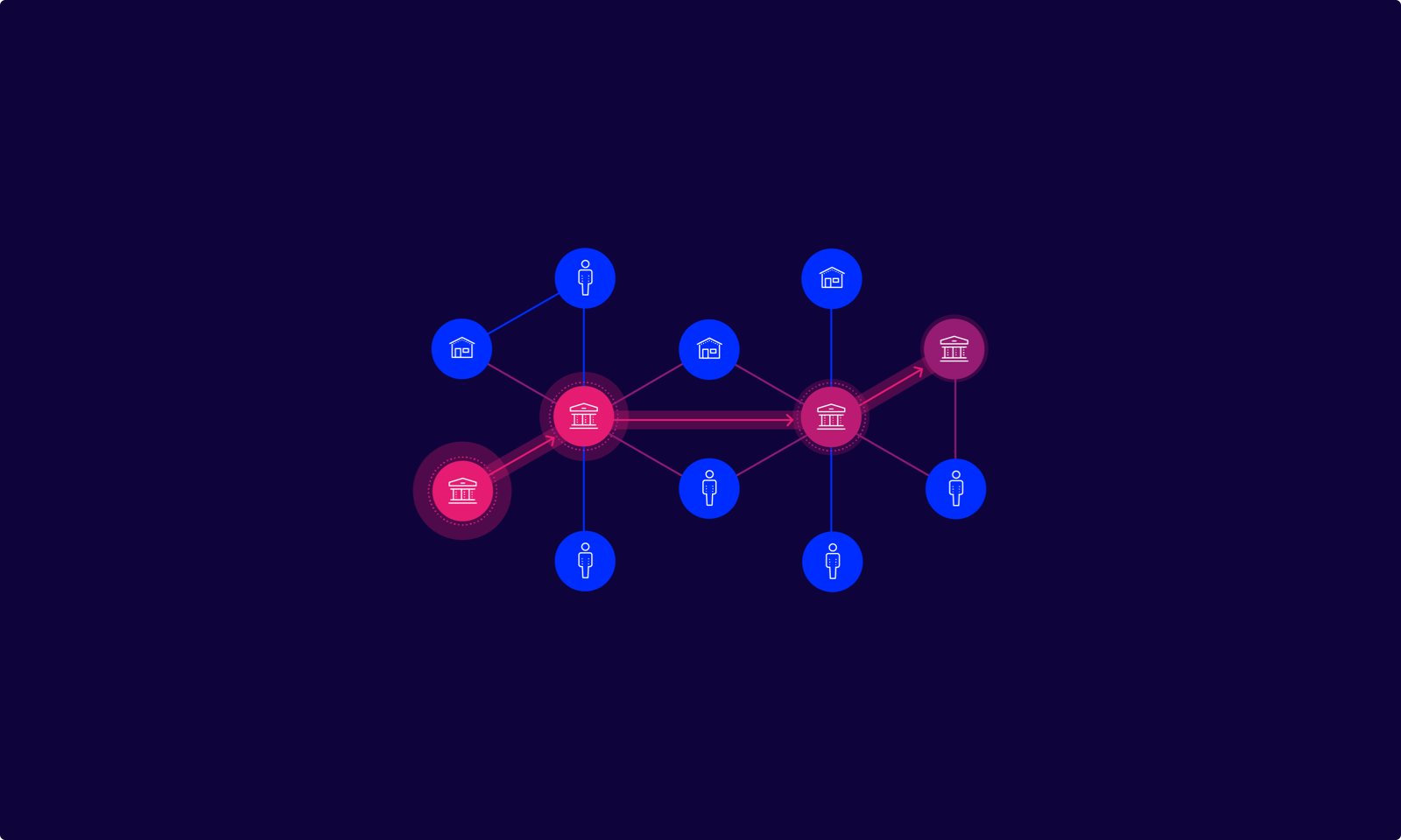
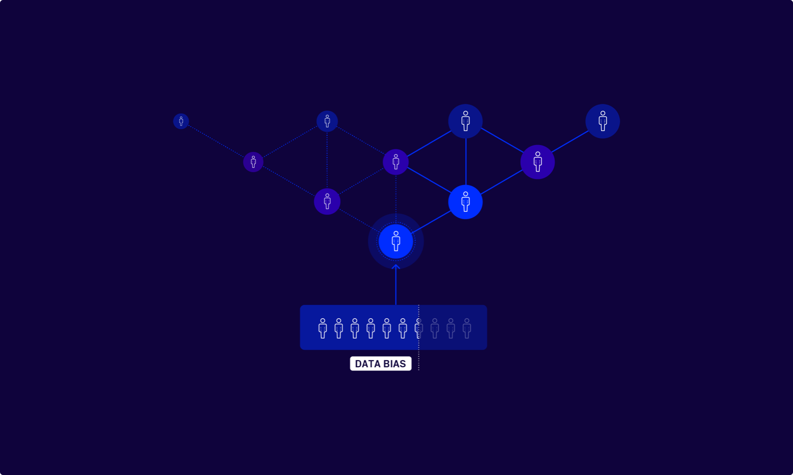
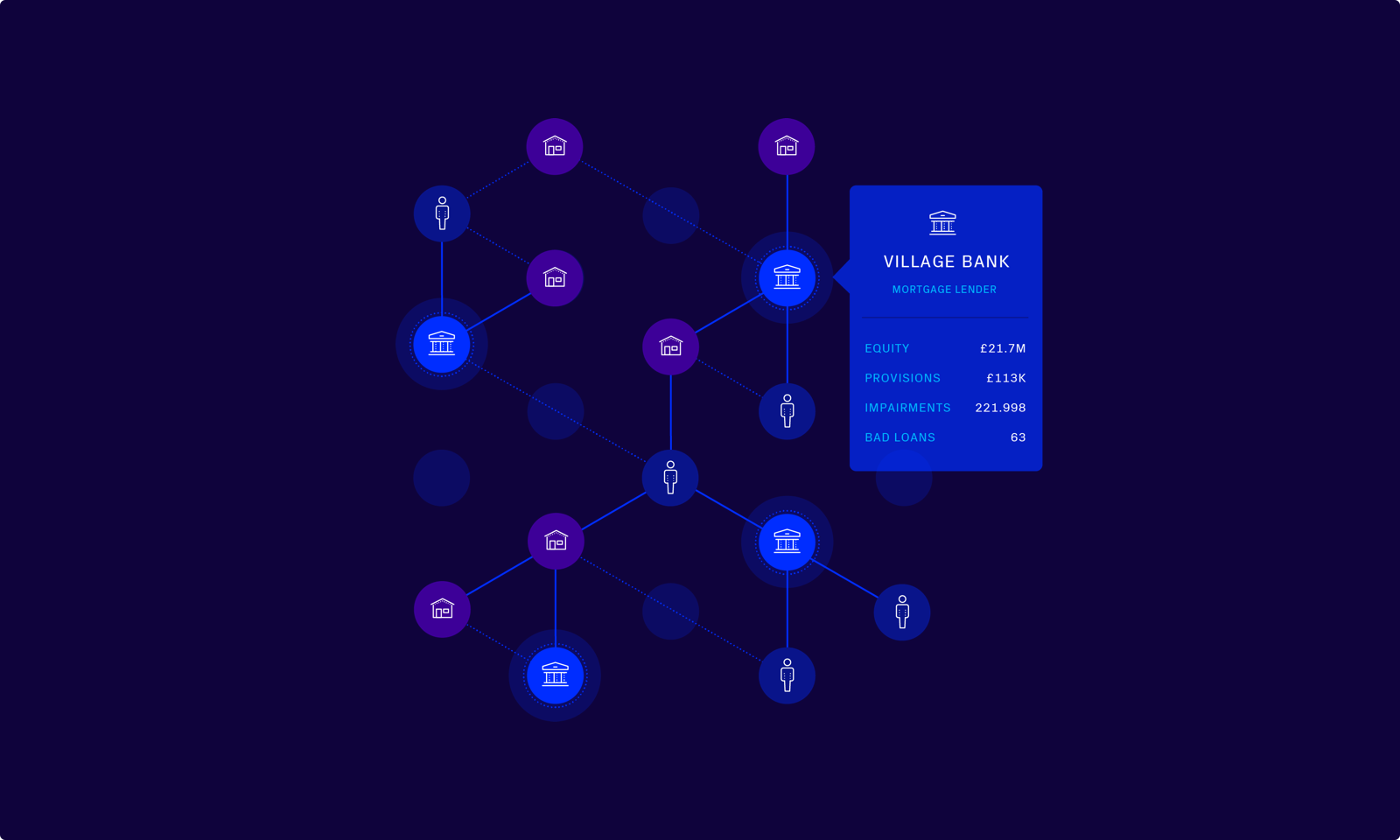
Diagrams
To create consistency across all marketing and new business channels, a series of diagrams have been developed to articulate the various problems and Simudyne solutions in each given sector.
Product Videos
Some legacy explainer videos have been reworked to match the brand style.
Photography
Photography is an important part of Simudyne’s identity. It adds personality to the brand and should be used to capture the spirit of the business. High quality photography should be commissioned whenever possible to maintain the sophistication of the overall identity. There are three key components to the photography requirements.
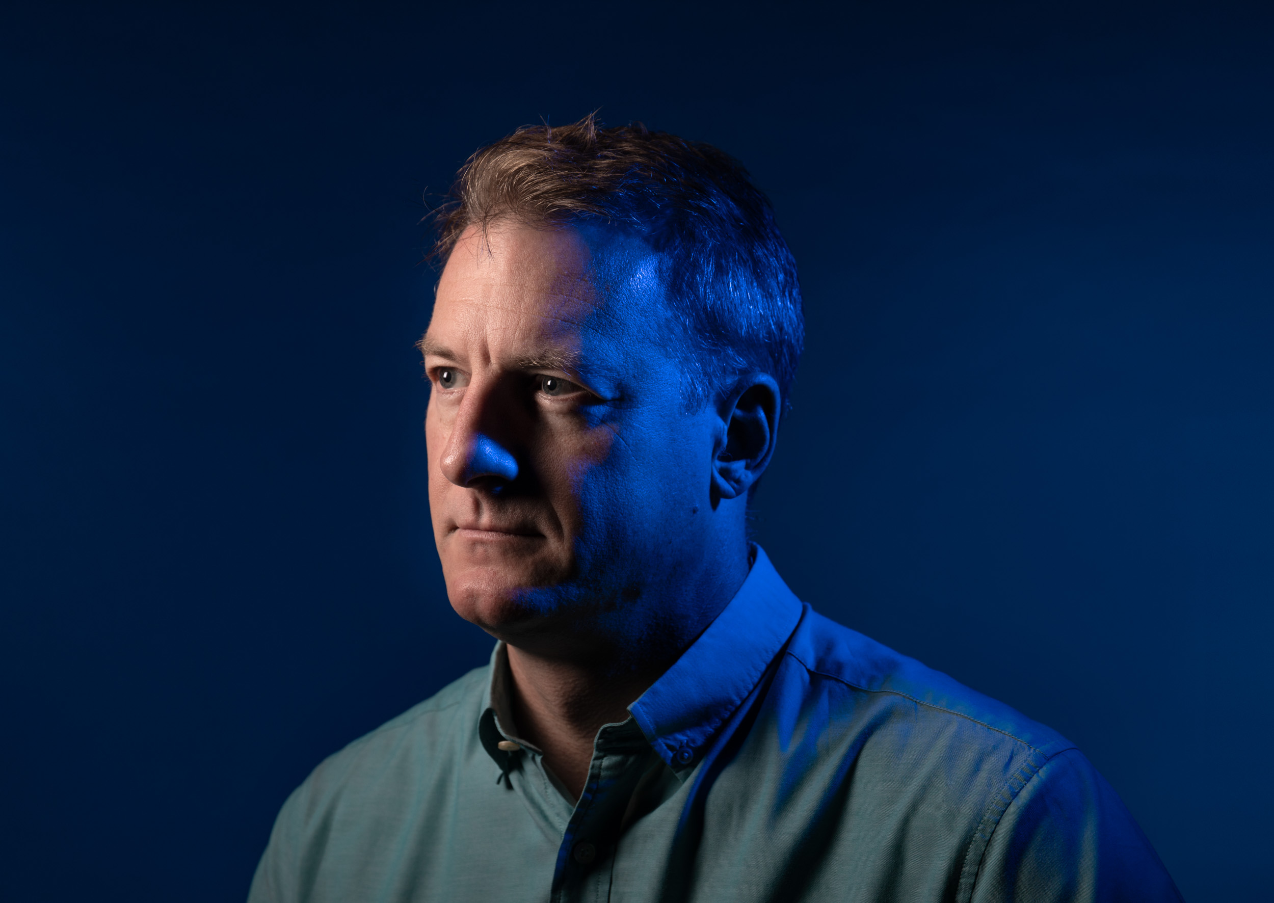
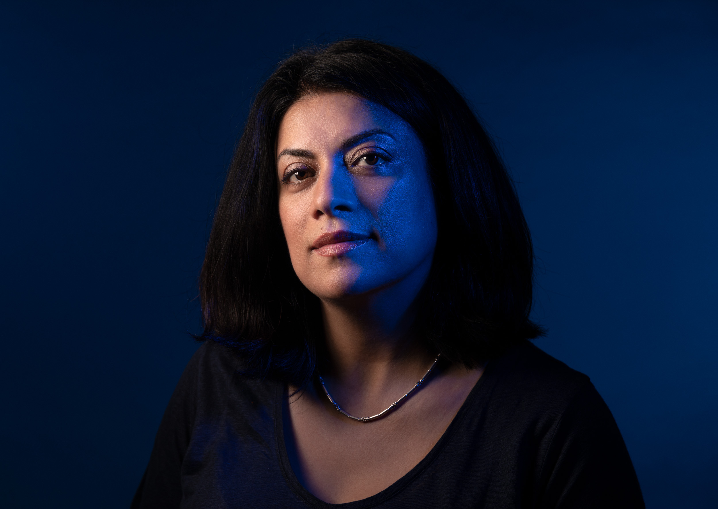
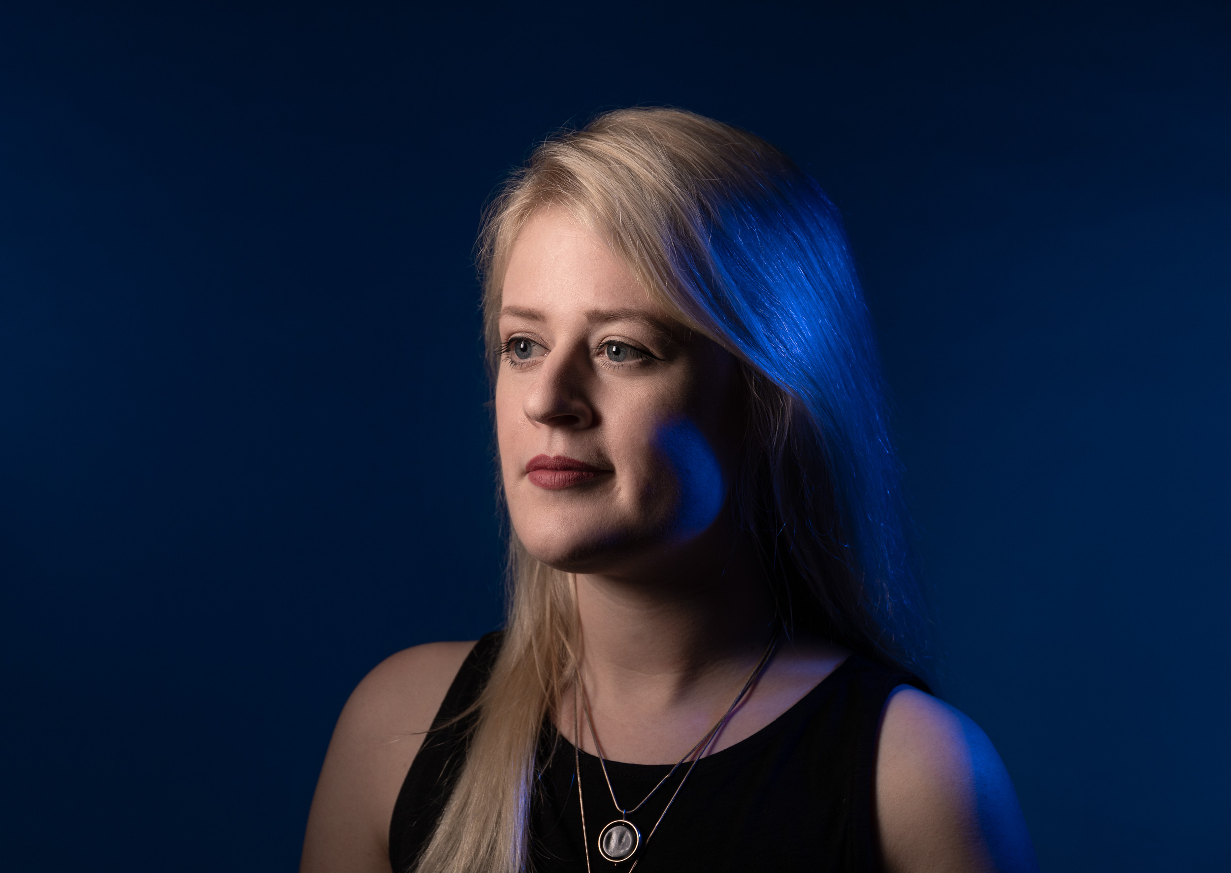
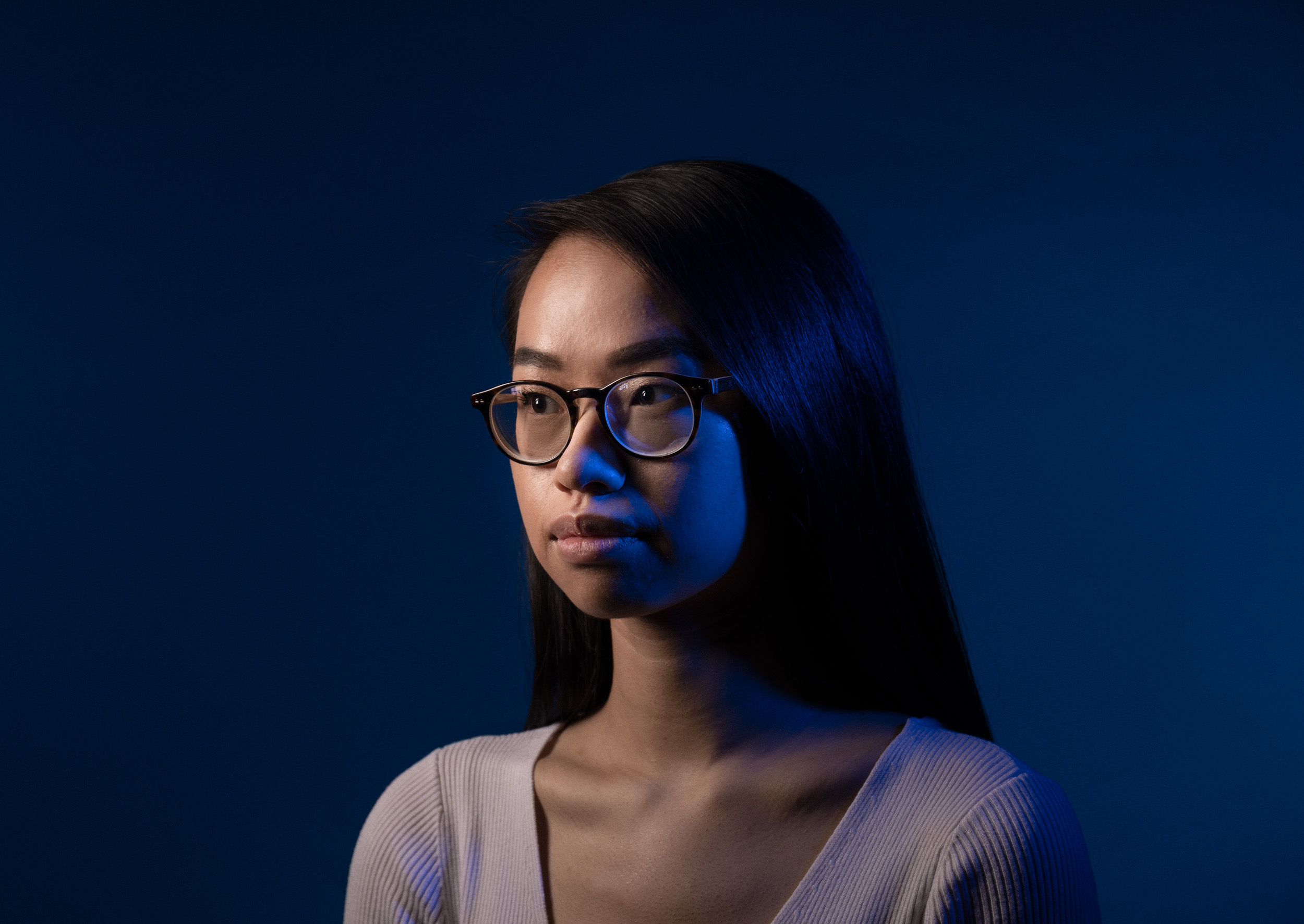
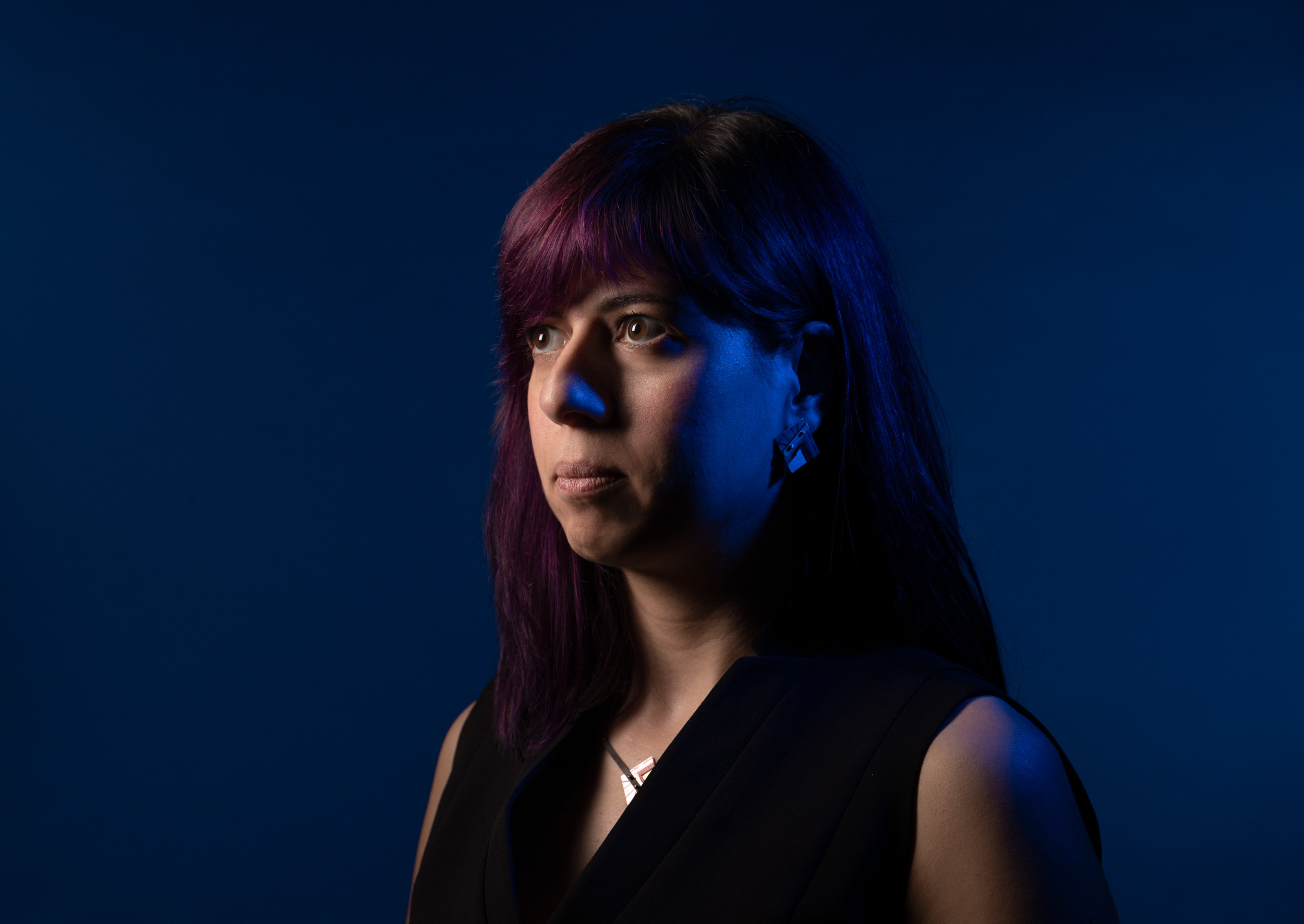
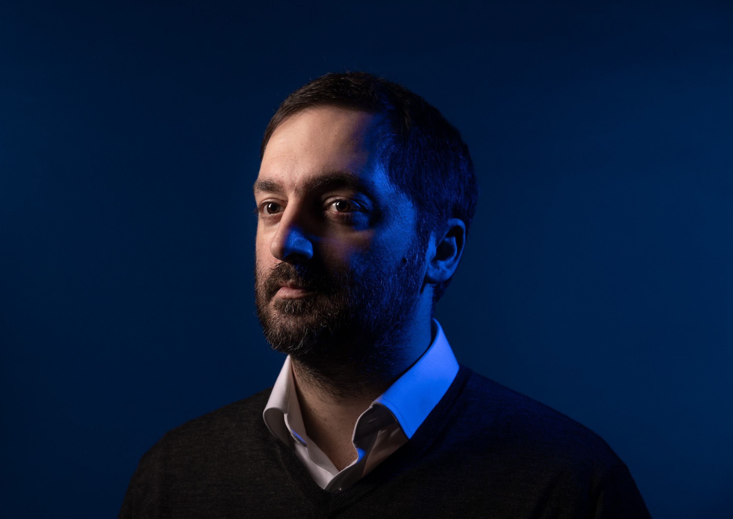
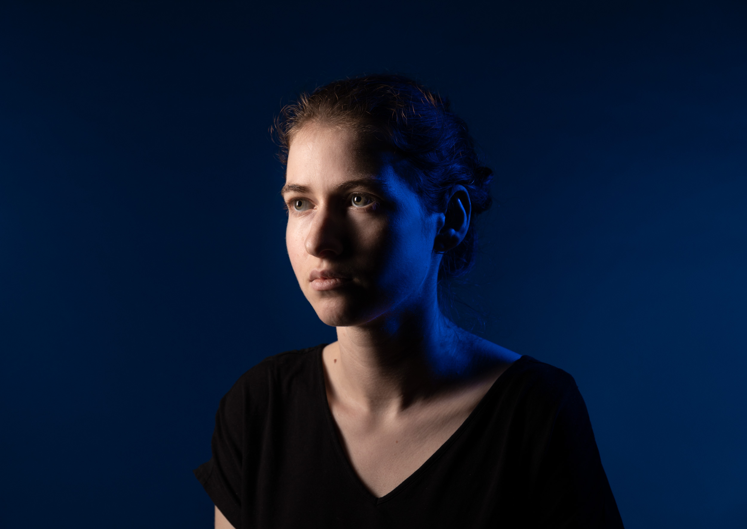
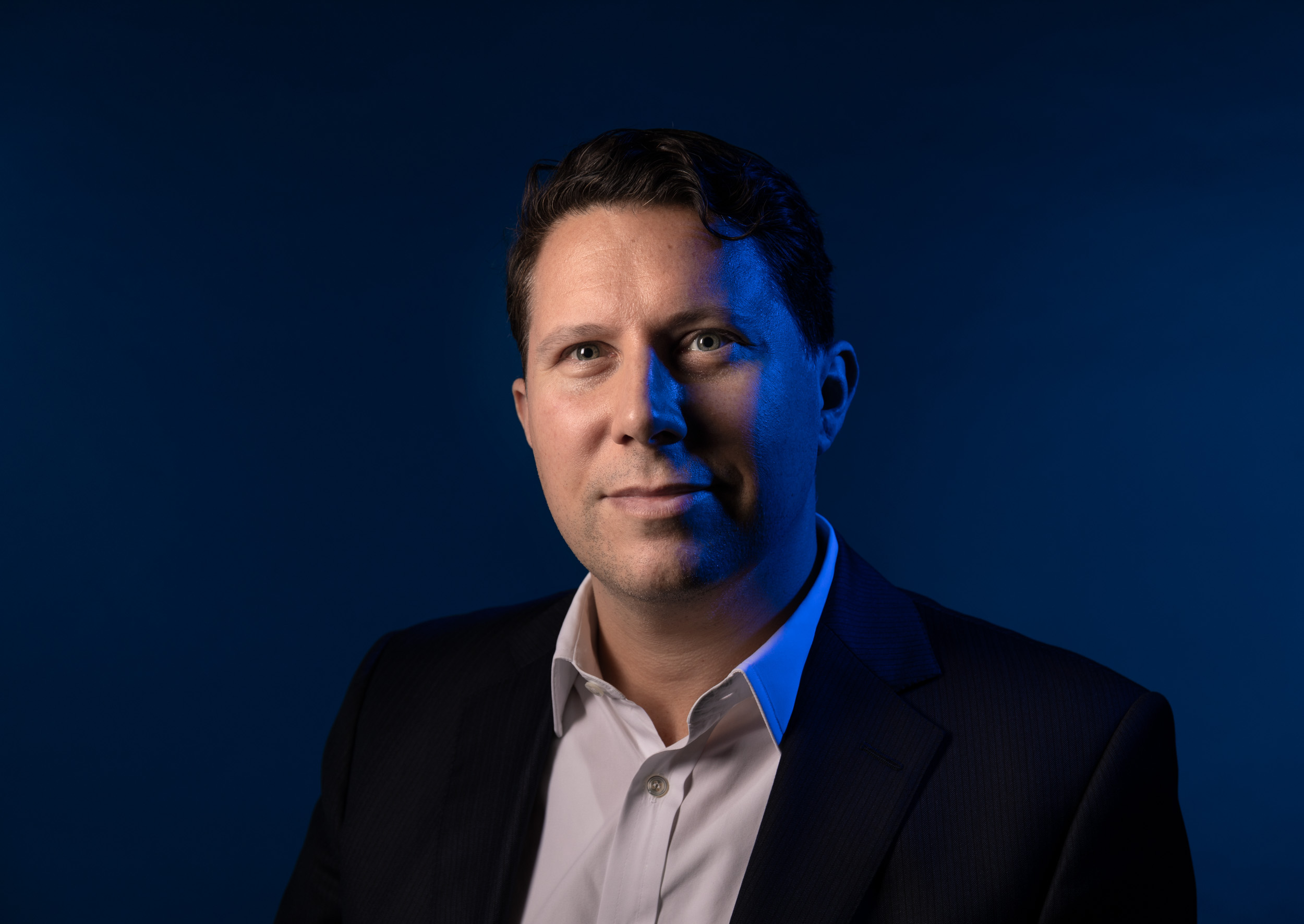
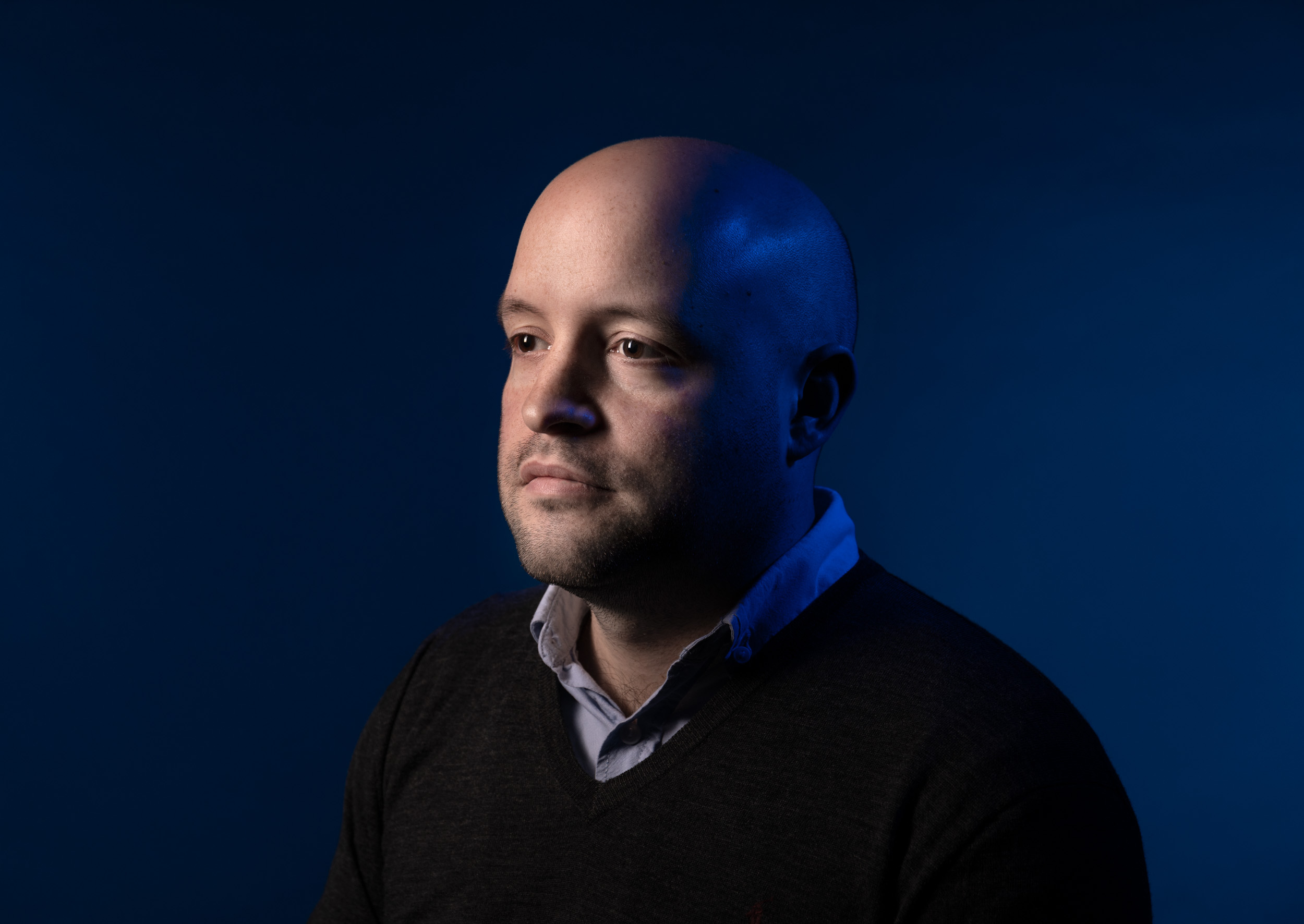
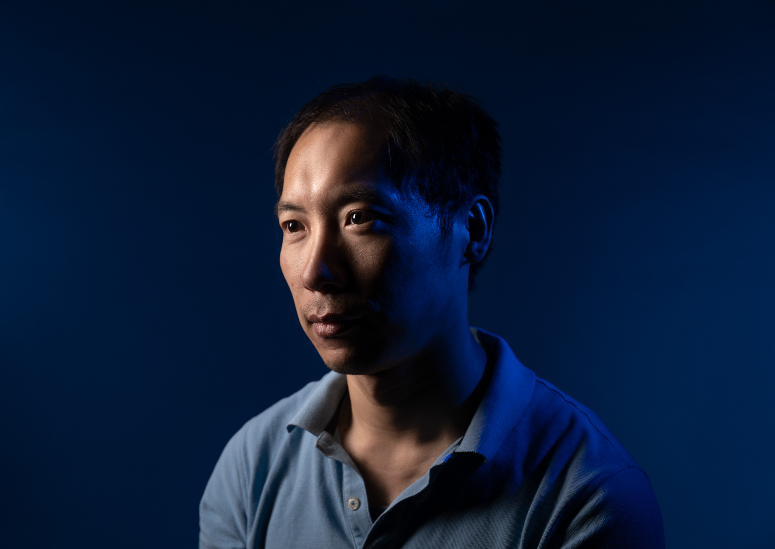
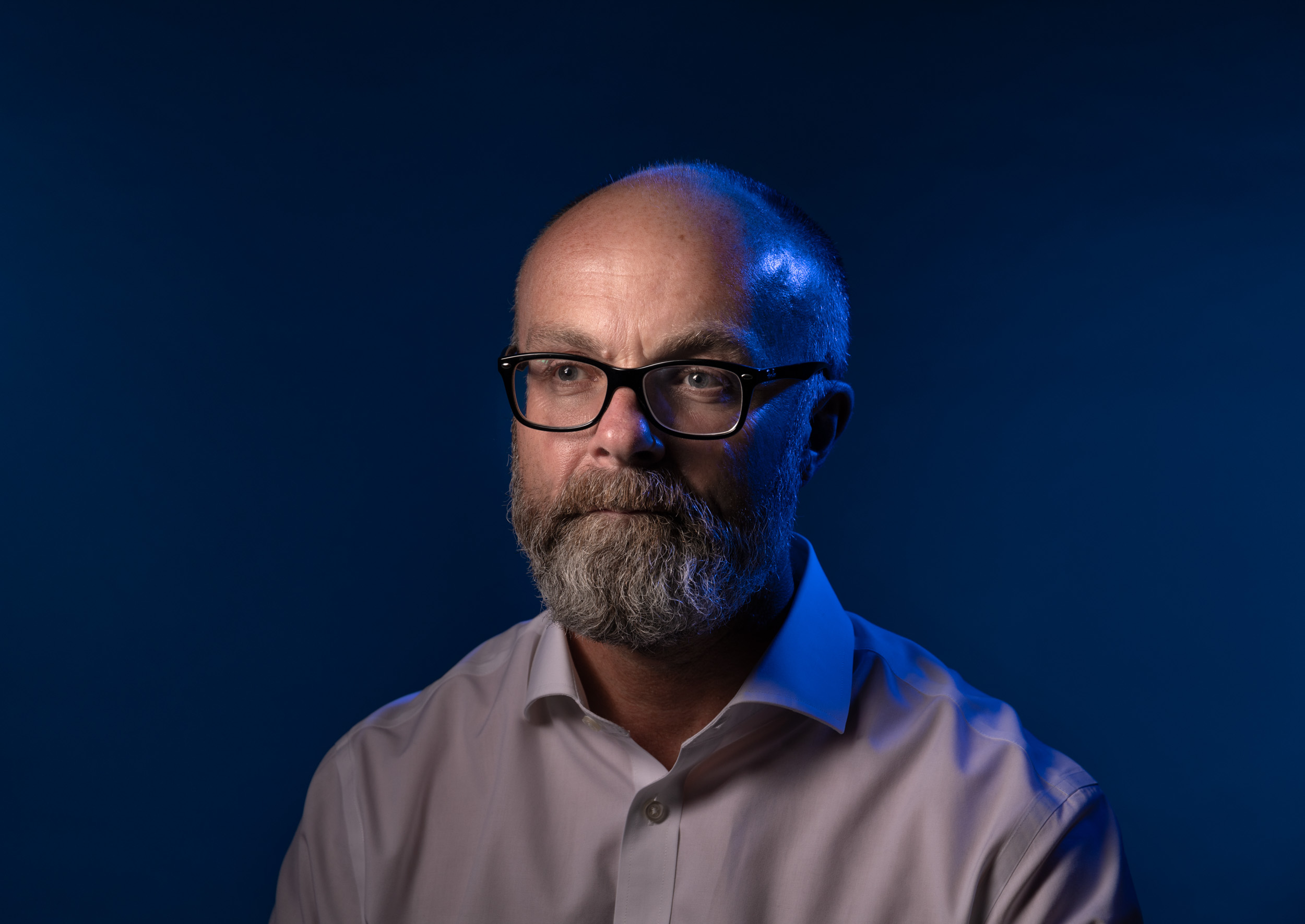
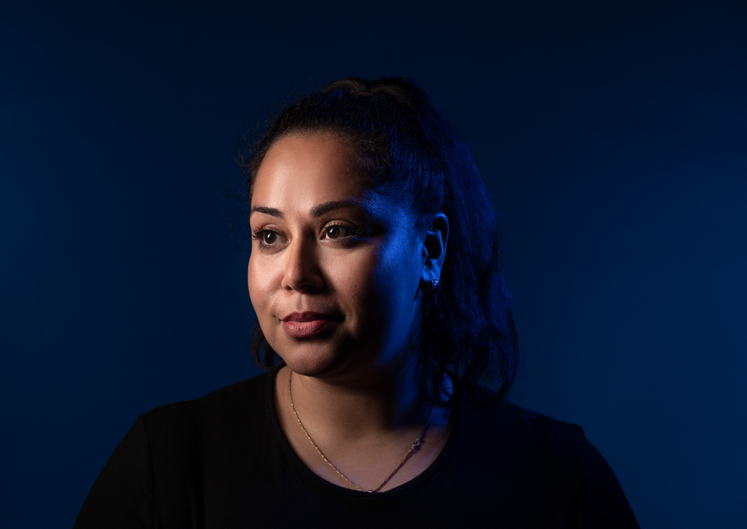
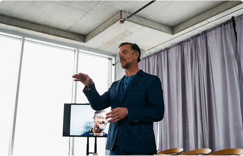
Portrait Photography
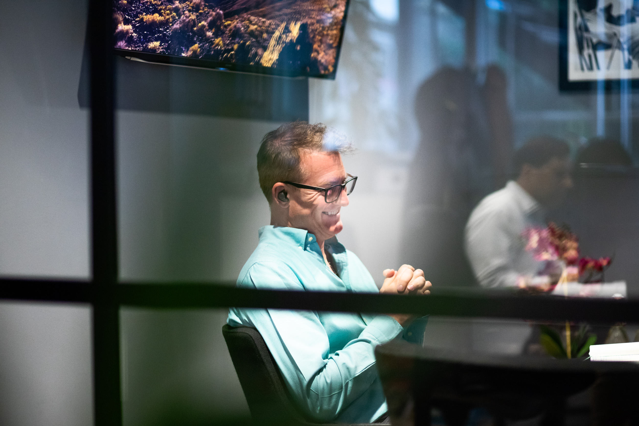
The art direction portrait photography aligns with the overall visual identity. It conveys the serious, laser-focused ambition within the Simudyne team. The primary objective is to communicate a sense of intelligence and authority but there are also opportunities here to balance this out with more natural candid shots to show people’s personalities.


Lifestyle/Culture Photography
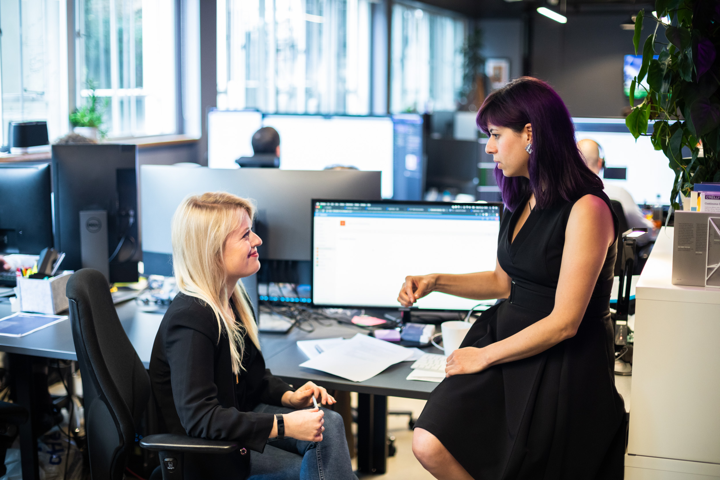
Capturing the day-to-day experience of working at Simudyne is also important. It should demonstrate the rich interplay of a multinational, multi-talented team working together to solve the world biggest problems. This photography should have an editorial, reportage feel and be as natural as possible.


Stock Photography
In a world where content is being generated frequently it is important to enrich these editorial pieces with the right photography. Curating the right stock photography is essential in maintaining Simudyne’s high-value authorship. This is a guide to selecting the right photography.
Choosing the right photography
The right photography should use dramatic angles, use of space and a sense of authenticity. Photography subject matter doesn’t need to be overly literal but should always capture the overall essence of a piece.


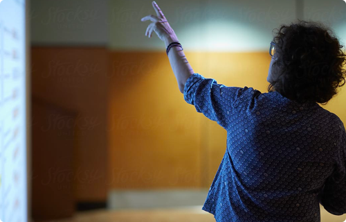
What to avoid when choosing stock photography
It is important to understand what not to choose when selecting stock images. Don’t use images that are too staged or use unnatural light sources. Don’t select any images with graphic overlays or applied digital effects. Don’t use illustrations from stock libraries.

![]() No futuristic projections
No futuristic projections

![]() No glowing illustrations
No glowing illustrations

![]() No cliché stock imagery
No cliché stock imagery

![]() No futuristic projections
No futuristic projections

![]() No futuristic projections
No futuristic projections
![]() No cliché stock imagery
No cliché stock imagery

![]() No futuristic projections
No futuristic projections

![]() No cliché stock imagery
No cliché stock imagery

![]() No cliché stock imagery
No cliché stock imagery
Our Tone Of Voice
At Simudyne, we’re using data to create truly transformative products. To be heard, we need to express what we do with words that work hard to bridge the gap between experts and non-experts.
We want to create razor-sharp content to showcase our expertise and technology in a straight-talking way. Our tone of voice is our brand’s personality, reflected in our words.
How We Sound
At Simudyne, we use American spelling for consistency across our written work.
Optimistic
We’re excited about what we do and want get this across in our writing. To show our optimism for our products, we use positive and active language.
We’re never ordinary, boring or dull. We love what we’re doing and we want the world to see what we see.
Expertise
We talk with authority because we’re specialists in our field. The great thing about authority is that people will always feel that they’re getting valuable information and are much more likely to stick to what they’re reading.
However, just because we know something inside out doesn’t mean everybody else does. It’s important that we keep an eye out for words that are domain language to us but might not be clear to others.
Open
Just as we are in real life, our content is inclusive and accessible. We use language that reflects diversity and we’re never critical, exclusive or prejudice.
Authentic
Often, the best way to sound authentic is to just write in plain English. Words people use in everyday life. Of course we’ll need to use jargon sometimes – it’d be impossible not to given the subjects we’re talking about, but be friendly with it and try to explain it if it’s particularly uncommon in real life conversations.
Direct
This means we’re efficient with our words and get to the point as quickly as possible. A no-nonsense approach will help us keep our readers’ eyes focused on what we’re saying.
Modern
We’re not old fashioned, frilly or predictable. We’re contemporary and progressive. We write in the present tense and use language of today. This doesn’t mean using ‘dumbed-down’ language; we use rich and varied language, but we make sure it’s clear.
TOV Examples
Example 1
The Age Of Simulation
Computer simulation is the most powerful way yet to test drive our decisions, fail fast without any consequences and decide the best path forward. Simulation makes data work harder for us so our outputs are better (in government, finance and in science).
Ask yourself: Are you really making the best choices?
Could simulation do it better? Are there any factors that simply cannot be quantified quickly enough by humans?
Example 2
Making Big Data Useful
Using computer modeling and simulation, we can hyper-tailor treatments, services to your business’s needs and help you reach people in ways that are genuinely transformative. Using simulation to convert data into valuable analysis, insight and output means that we can work more accurately and usefully.
Example 3
So how does Simudyne (we) sound and what’s its (our) writing style?
A friendly but professional, passionate but articulate voice. Our copy talks with expertise/total ownership of the subject and delivers the benefits without any delay. We want to be completely concrete in everything we say. We’re not afraid to use domain language (a kinder way of saying jargon) but only if it’s necessary (which will probably be often). Everything else – the verbs and most descriptors – should be the plainest form. This way, an educated 12-year-old will comprehend most of the copy, industry professionals will see the benefits, and subject experts will see understand the exact science behind that we’re saying and find no fault in it.
Example 4
Our Technology
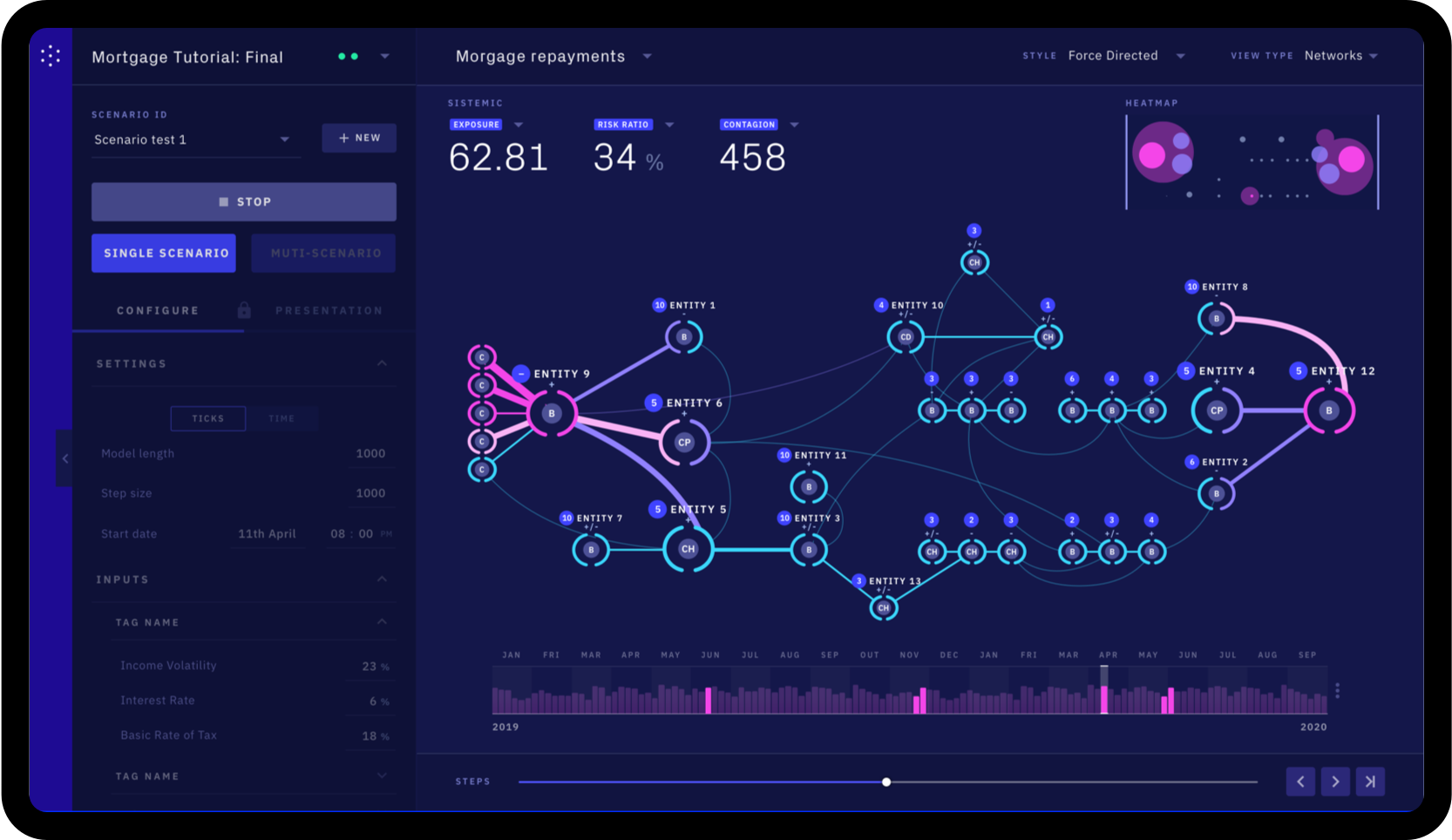
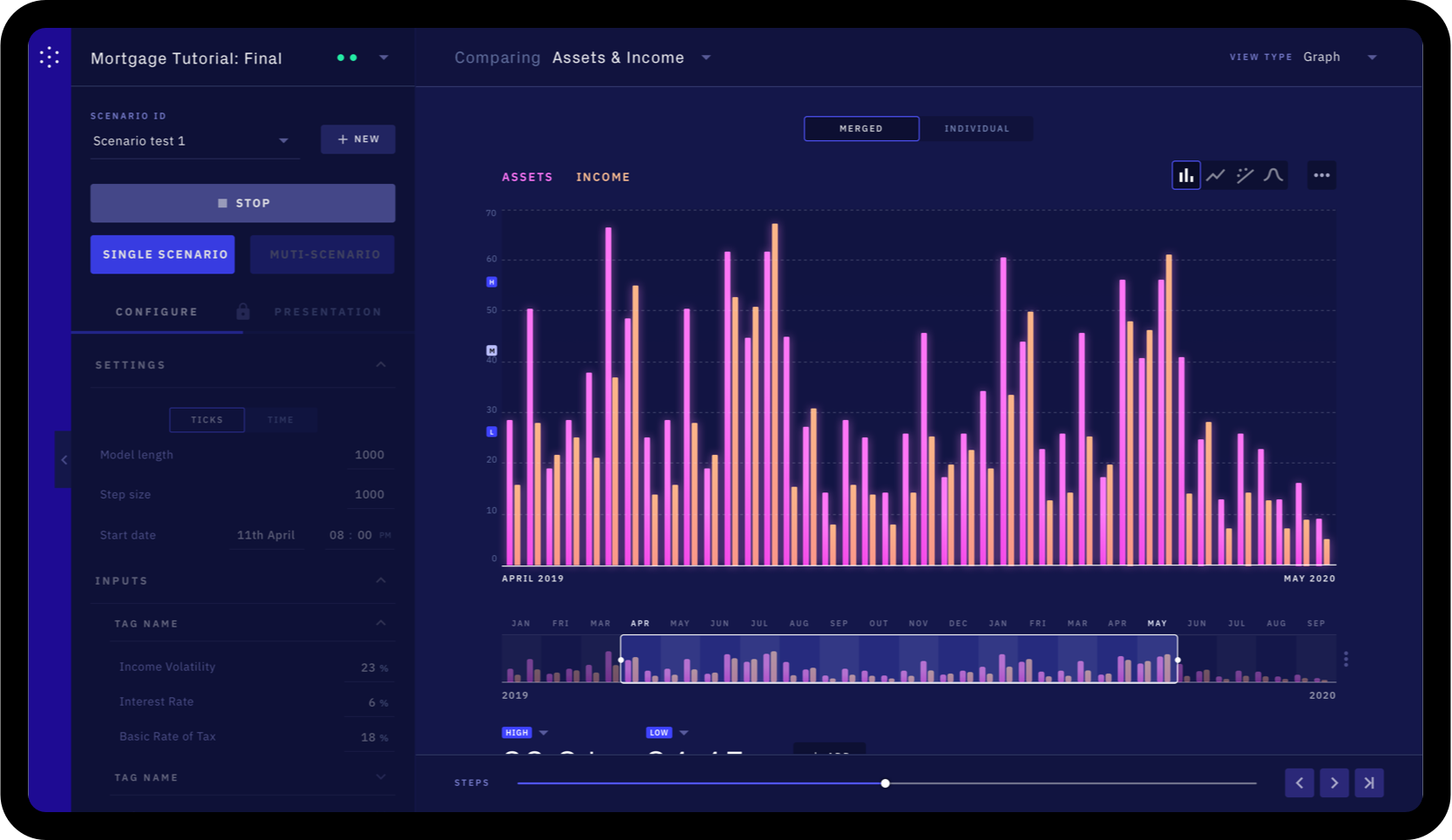
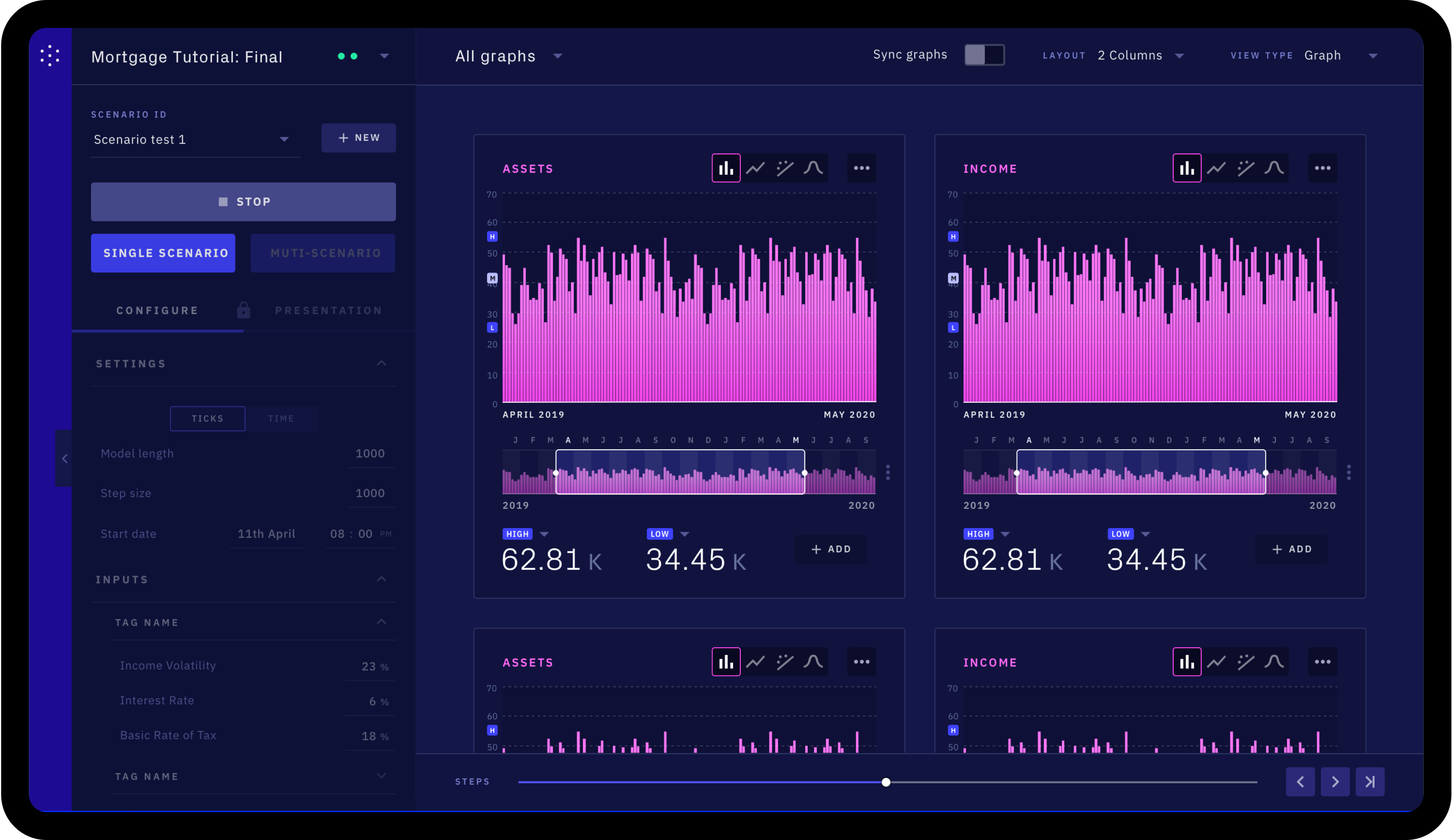
With Simudyne, Cloudera and Microsoft, we’ll give you the power to simulate our complex and interconnected financial system. You’ll be able to see the pain-points in financial networks that leave businesses ill prepared for contagion risk, tail events and emergent phenomenon. Traditional modeling forces us to assume a trajectory that’s tightly bound to historical data. But the past can be a poor indicator of the future and it doesn’t tell us the risks underpinning the investment and trade decisions that financial institutions make Simudyne enables modelers to build predictive and massively scalable models. By integrating with the Cloudera Data Hub, Simudyne learns behaviors from your data and connects to existing tools for advanced analysis and visualization. Deployment on Azure and using Cloudera’s processing layer enables simulations of billions of calculations in seconds – without the need for expensive infrastructure. Decision makers can control their models from the Simudyne console, which will allow you to run ‘what if’ scenarios, drill into specific entities, and analyze the network. Simudyne, Cloudera and Microsoft Azure have delivered a tool for the curious that let you reveal a wider range of futures, uncover tail risks, and ultimately make real-world decisions.
Brand Application
This section demonstrates how all the brand elements come together to create a consistent and coherent identity system. All these items have been produced as part of the brand launch.
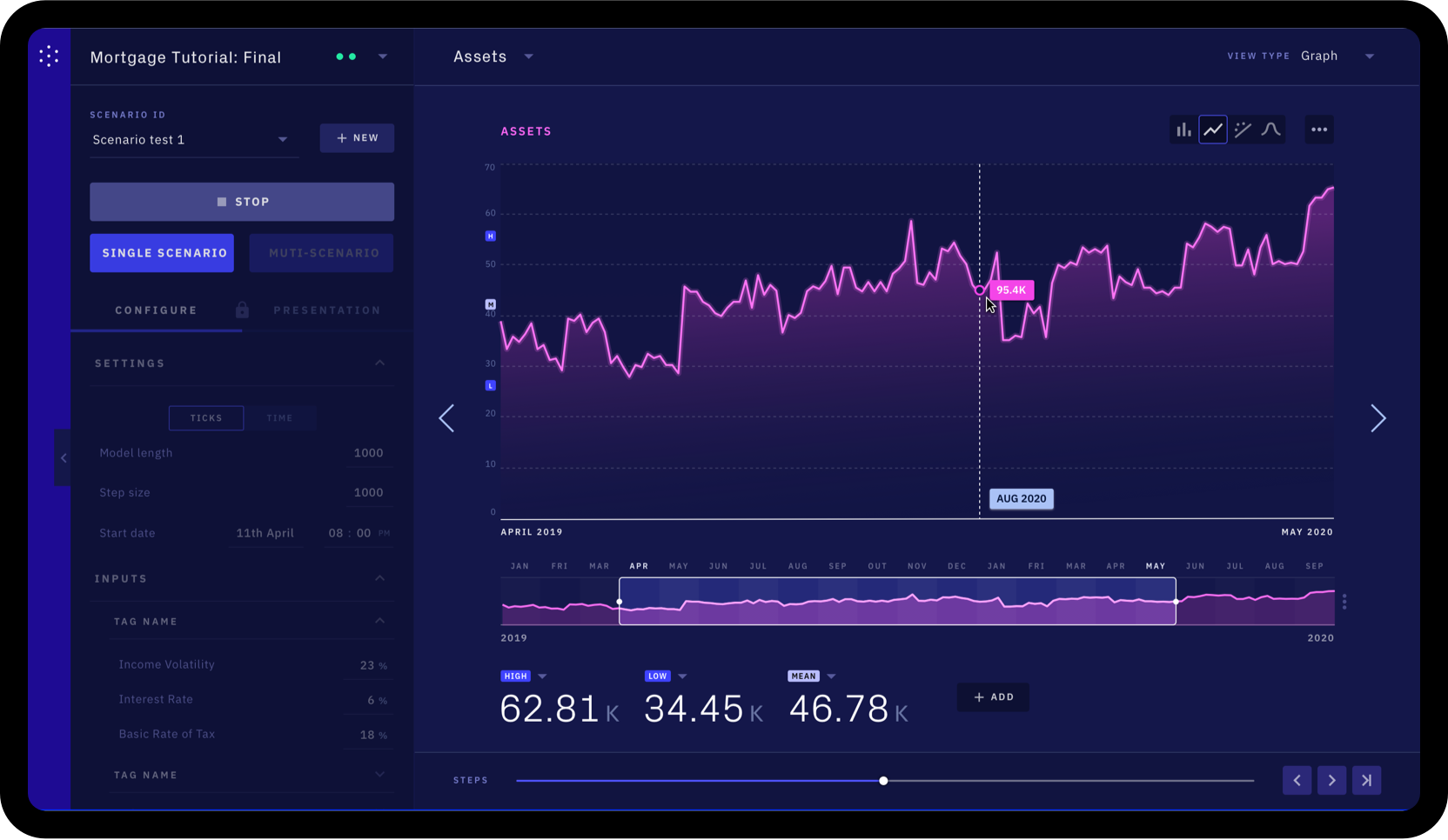
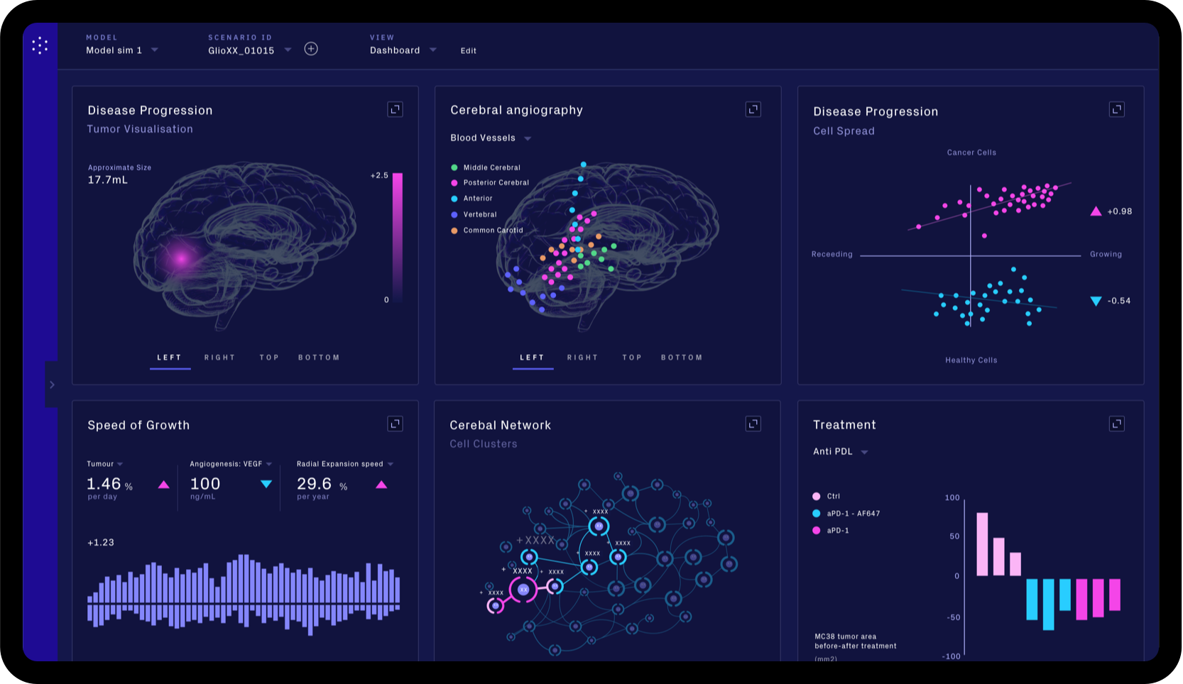
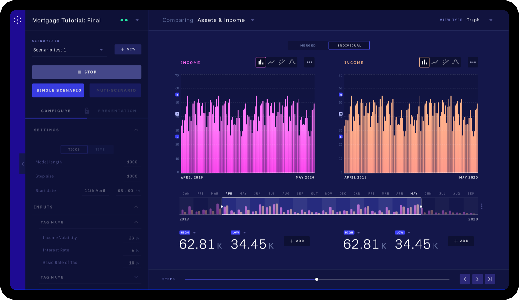
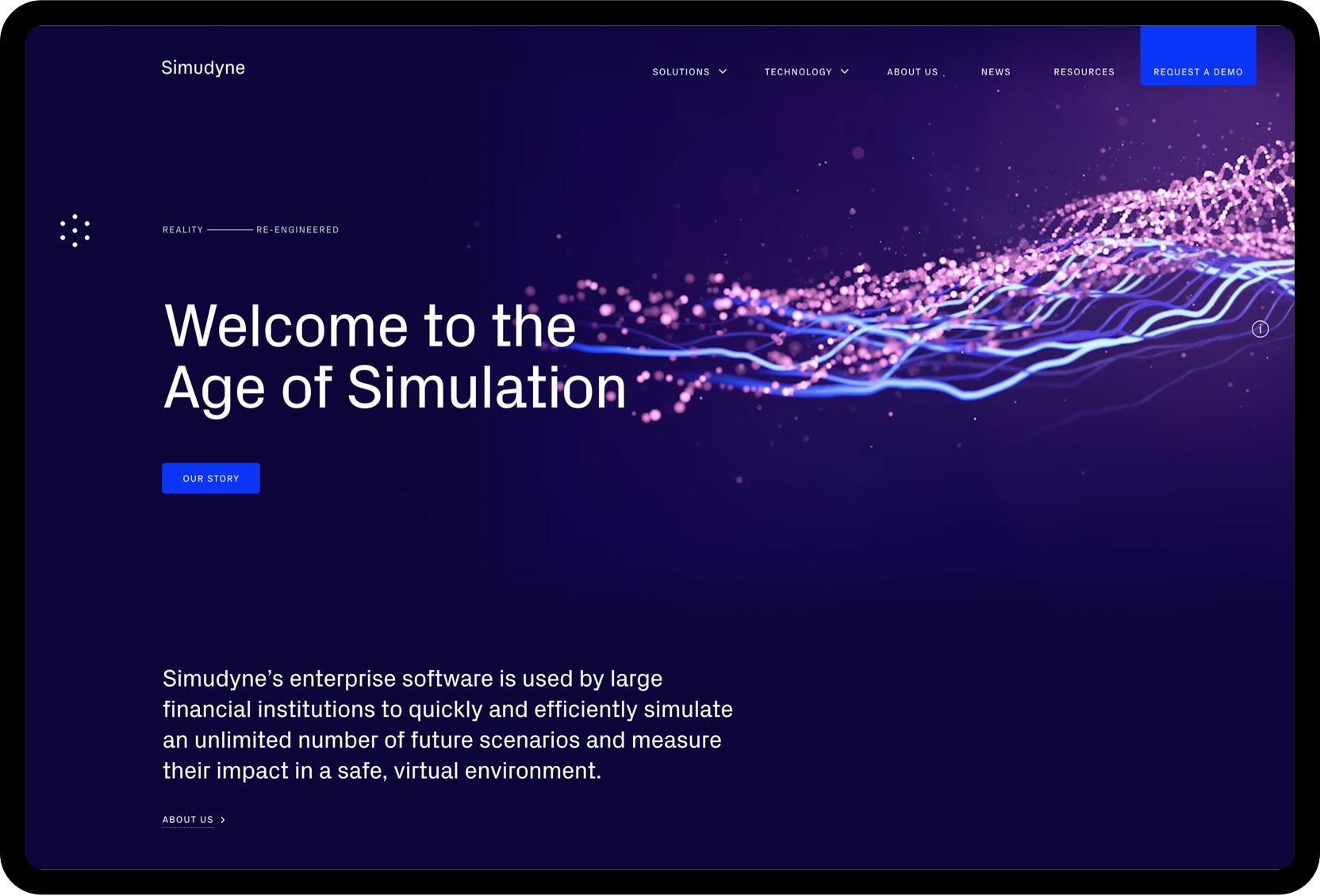
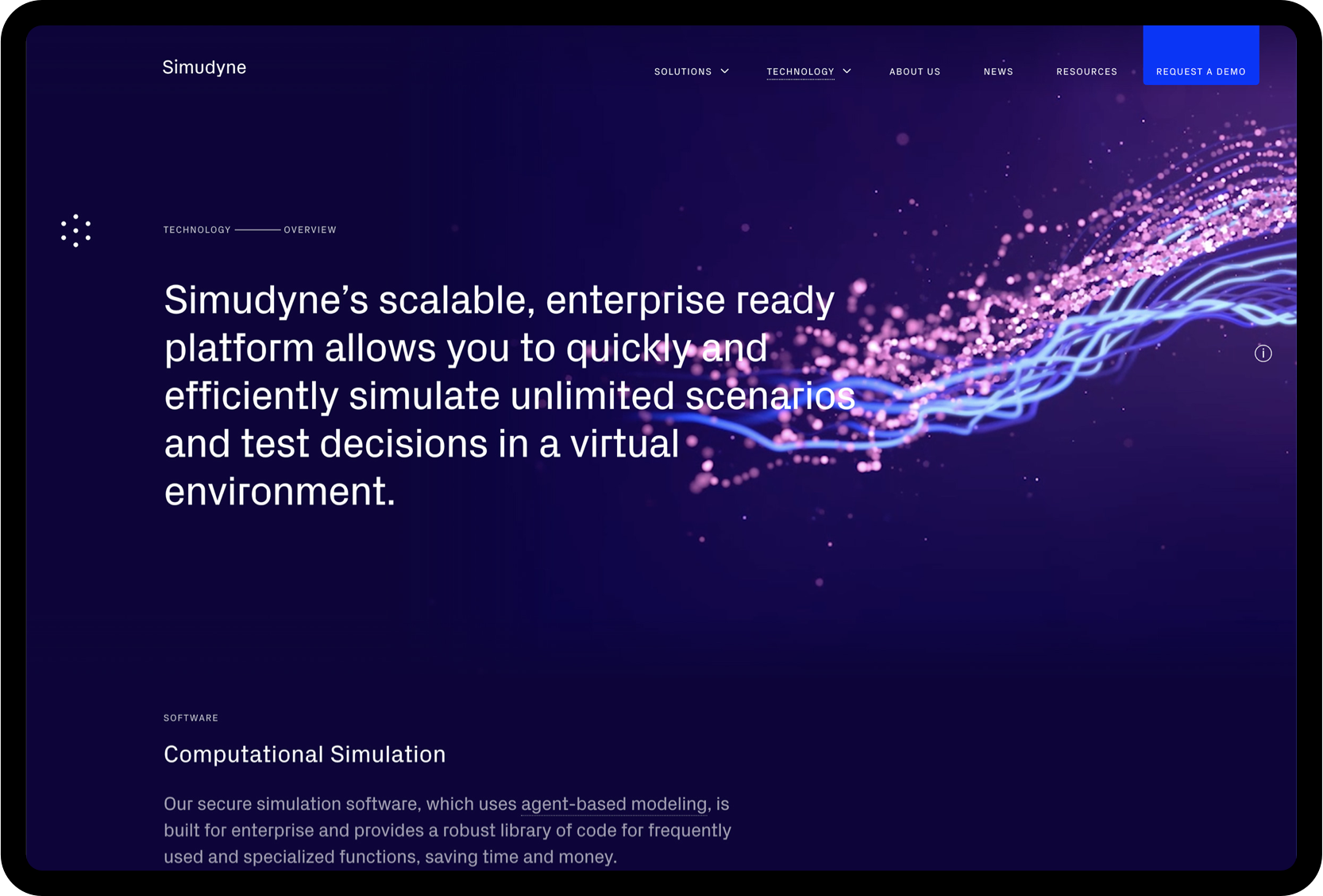
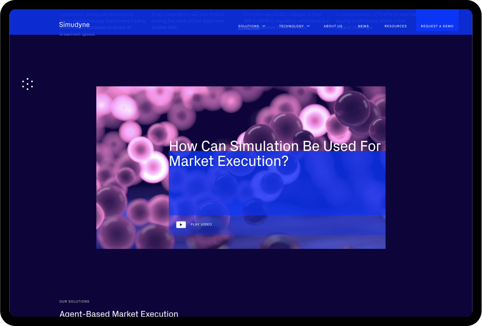
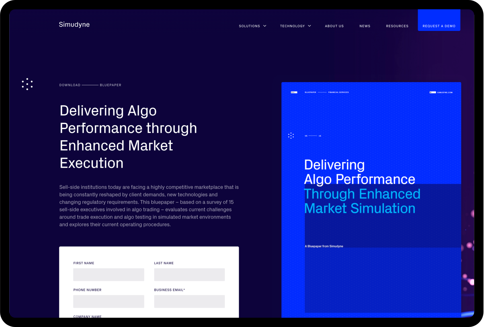
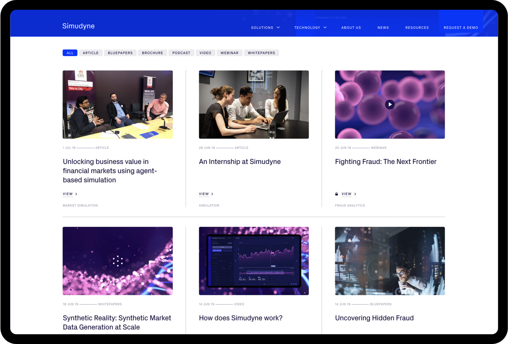
Website
The website is a fundamental part of business and utilizes all aspects of the visual identity and wider brand positioning in a single space. From typography to animations and content to tone of voice, the website encapsulates Simudyne’s ambition as a business.
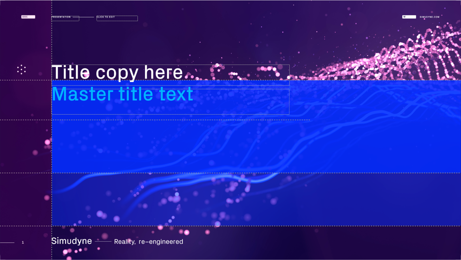
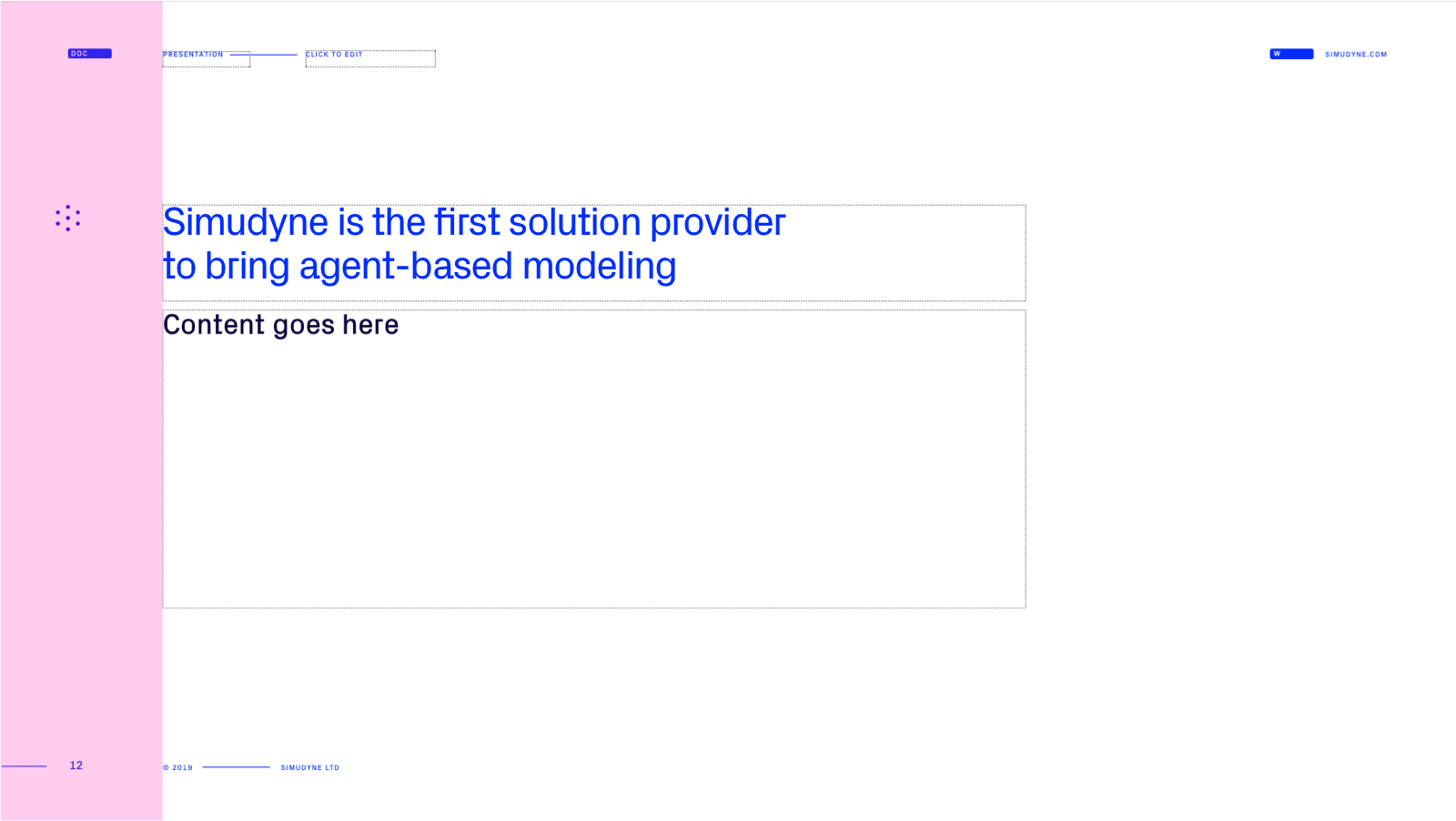
Presentations
One of the most important customer-facing brand assets is the PPT presentation. This is often the first impression of the brand and should feel as sophisticated and well considered as the rest of the communications. The below offers guidance on how to best layout the pages.

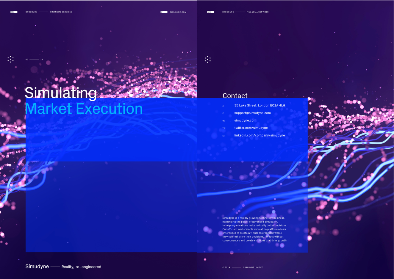
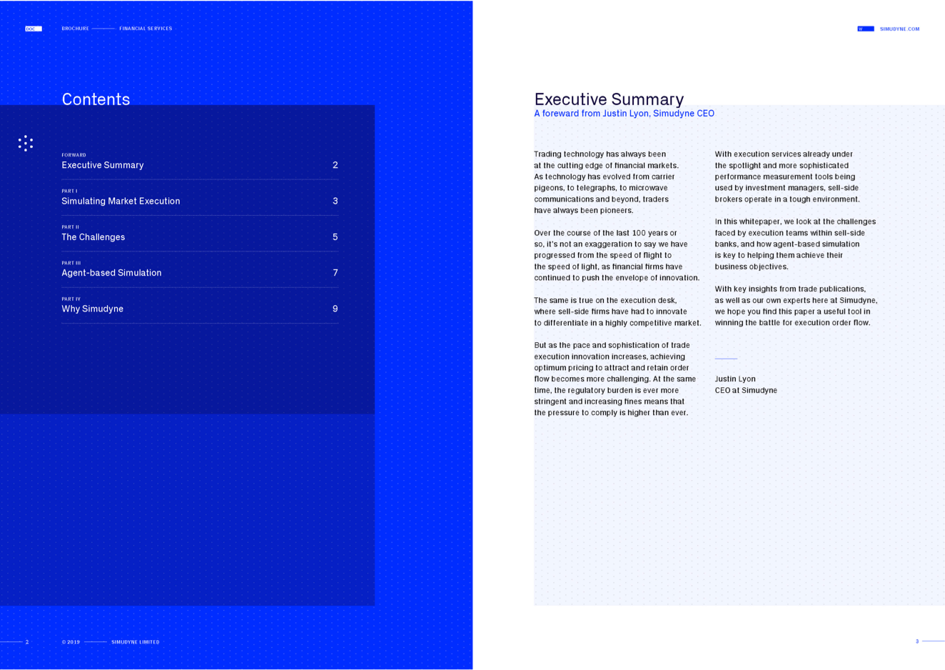
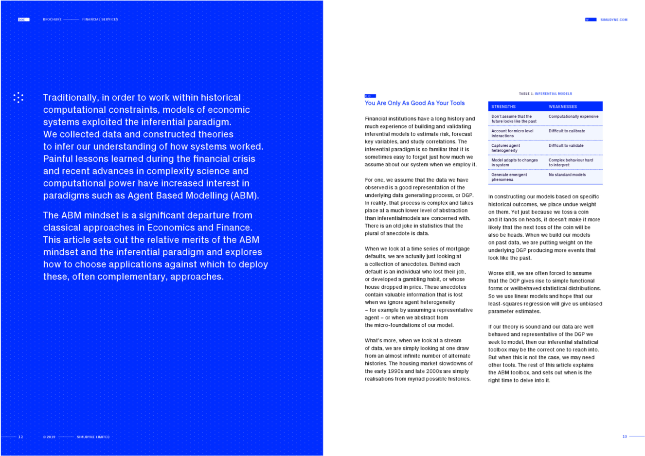
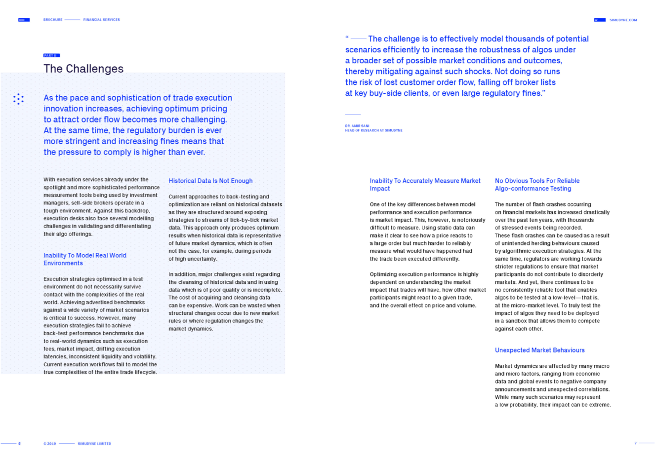
Brochures
Brochure design brings together the key components of the our new visual identity. Cover options and page templates have been created to aid the design process going forward.
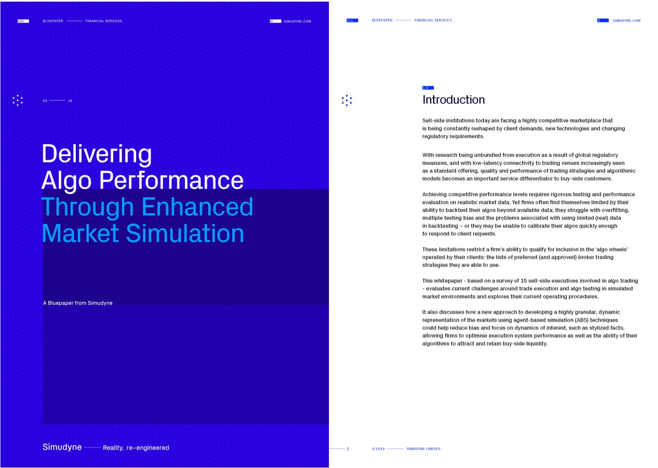
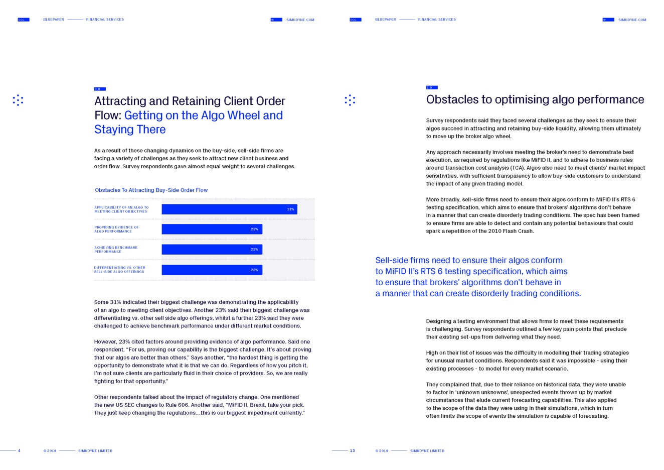
Bluepapers
To create a sense of authority and ownership we have coined the term ‘Bluepaper’. These documents contain our subject matter experts’ insight into the various sectors we work in. To differentiate these from the brochure design we have created a bold full-color blue cover to further enforce the ‘Bluepaper’ concept. There is also a template for this document which uses a simpler format devised for screen reading.
Stationary
The stationery design and key templates align with the overall brand look and feel.
Business Card

Letterhead